These days, most communication is done via the internet and most designers get their jobs on the internet as well. That's why it's easy to understand why most people don't bother to think about stationery that much. It just doesn't seem all that important anymore.
Well, is stationery important? Very much so. First of all, if you don't have custom stationery at your business, you don't look all that professional. Would you hire a lawyer that doesn't have their own stationery? Then why would you hire a designer without stationery?
As a designer, it's even more important to have good stationery. It's a part of your job – some clients will want you to give them the complete package – logo, color scheme, branding, stationery. You know, the works. What does having no stationery say about a designer? That he's not that good. Why would your client settle for second best? Would you?
Good looking stationery is almost as important as a good logo and a good identity. As a matter of fact, you can't really have a good identity without good stationery – business cards, envelopes, the whole package.
Furthermore, even for non-designers, stationery is very important. For one thing, stationery helps with networking. When you write your clients or another business (be it a holiday card or an invoice), the first thing they notice is the stationery you're using. Shoddy stationery just serves to undermine your credibility in front of your clients and collaborators.
The same goes for business cards. Whenever you meet someone on a work function, you should leave them with your card. That's just proper business etiquette. The business card is a great opener when at meetings or conferences. It should represent you well. Custom stationery just shows your client that you care about the business (your own, of course, but also theirs) enough and that you appreciate their business. Your card should be professional, but it should also talk about you.
Your business is constantly sending out communications. That's just the nature of business. Most of these are online these days, but there are still plenty of occasions where you have to use print. That's why you need stationery. For all those times. You need the whole range – business cards, letterheads, envelopes, pens, pencils, invoices, compliment slips, quotes and estimates, letters of recommendation, thanks and apology and so on. Of course, some of the things in that enumeration can use the same kind of stationery – but it shows that you care if you go the extra mile. The more you customize your stationery, the better.
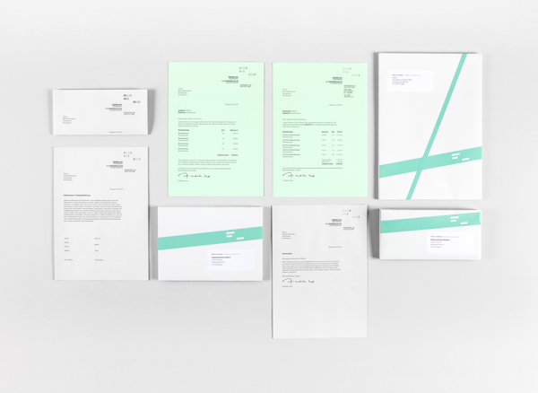
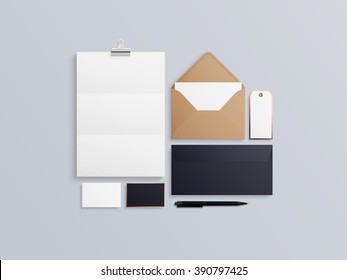
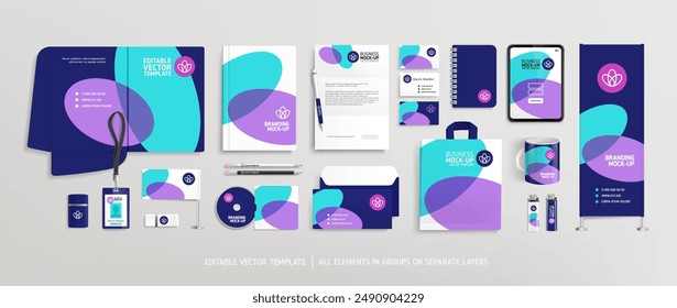
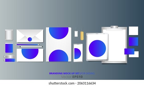
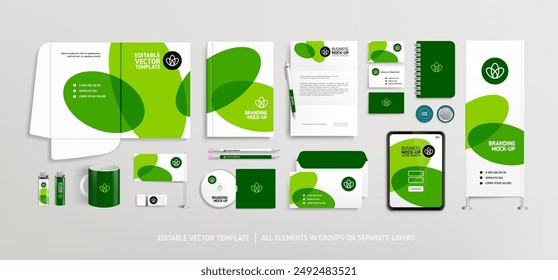
These are the reasons we've selected twenty very beautiful stationery mock ups. These are examples of how much great stationery can say about a company. They're here to serve as design inspiration for the designers reading this as well as to convince those reticent to use stationery to jump on that train. It's really not something you can pass on.
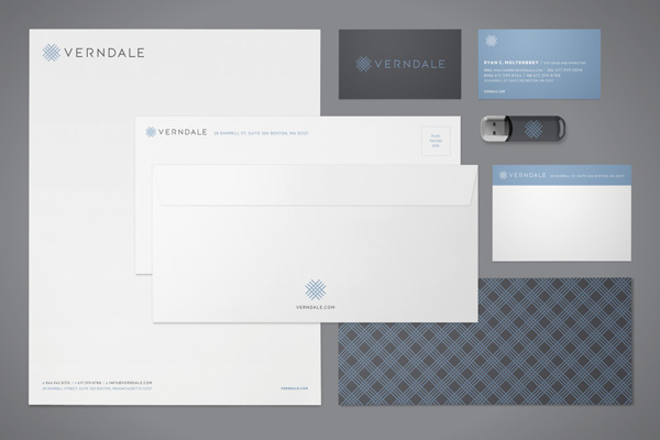
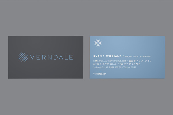
Verndale by Bluerock Design
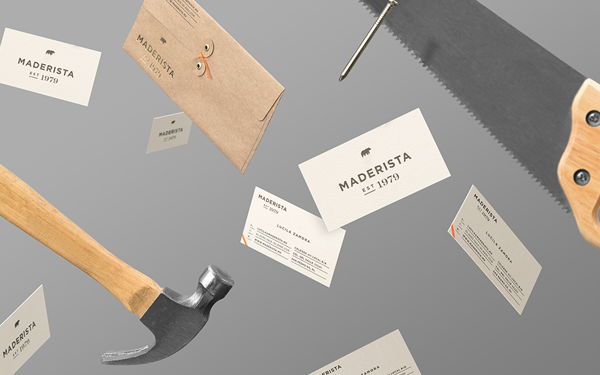
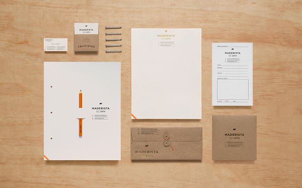
Maderista by Anagrama
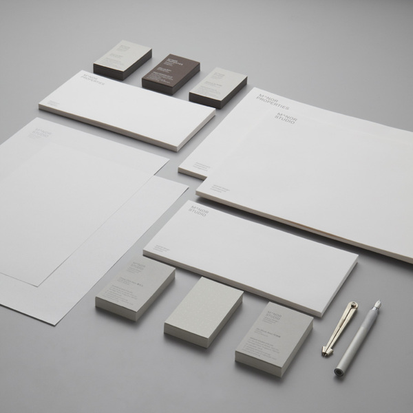
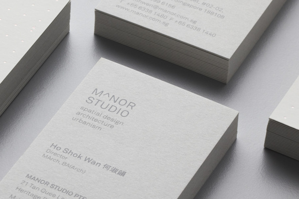
Manor Studio by Benjamin Koh
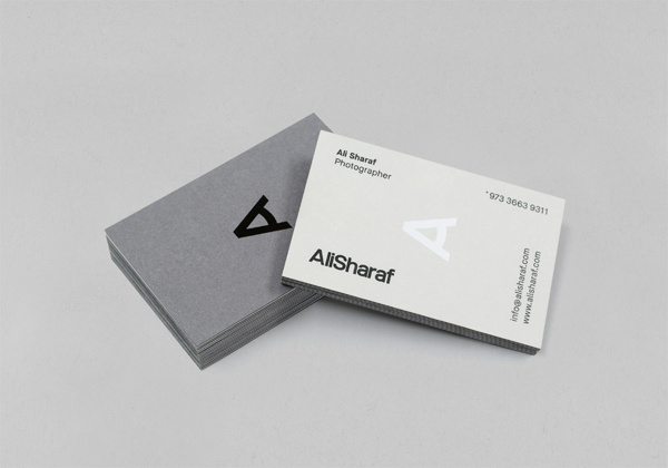
Ali Sharaf Photography by Mash Creative
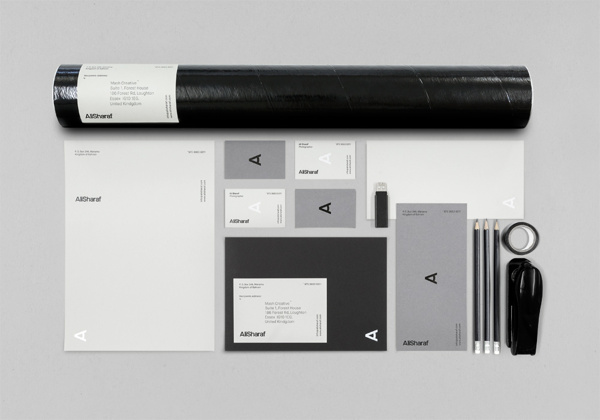
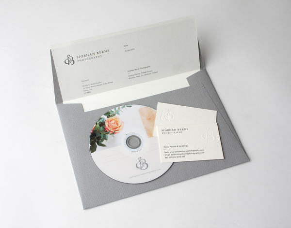
Siobhan Byrne by Passport
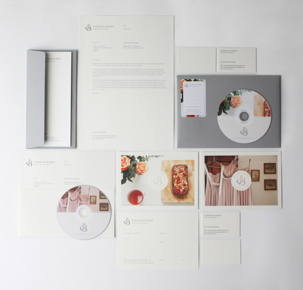
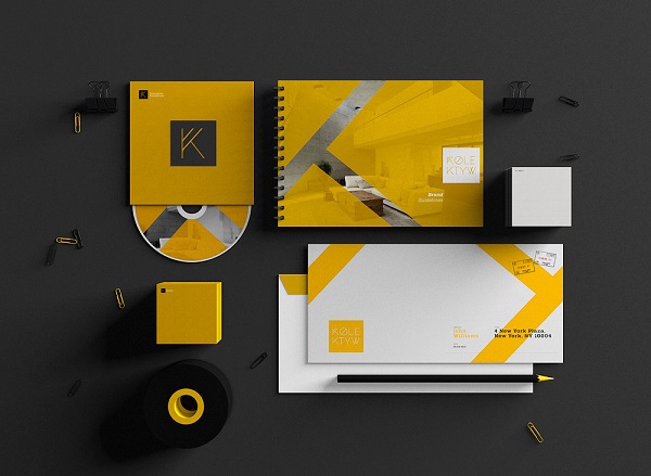
Kolektyw by Wojciech Zalot & Gosia Zalot
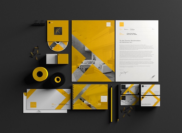
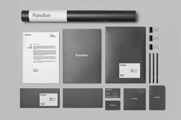
Branding / Stationery Mock Up by Zeisla
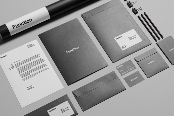
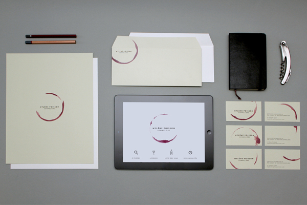
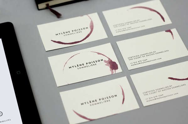
Mylène Poisson Sommelière by Caserne
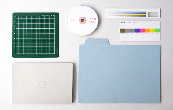
Antalis Design Stationery by Ken Lo
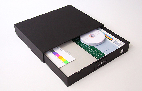
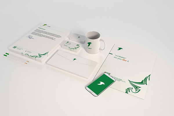
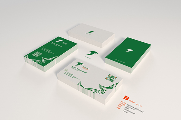
Stationery Mock-Up by TechNative
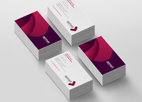
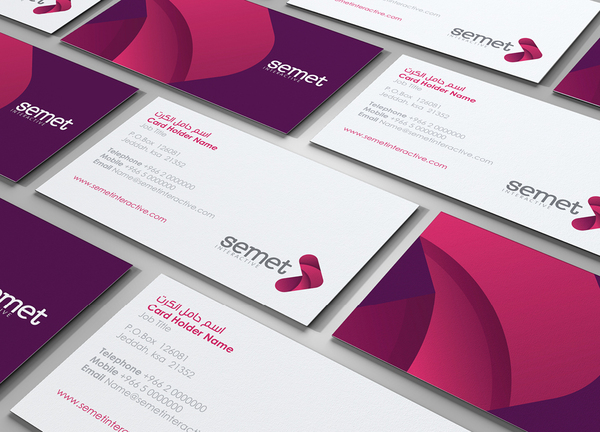
Semet Identity Branding by Mohd Almousa
Personal Identity by Ben Johnston
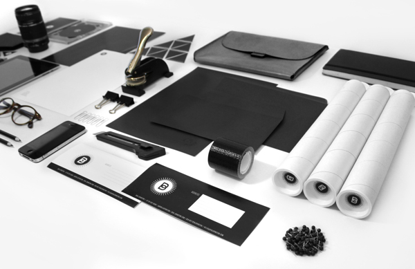
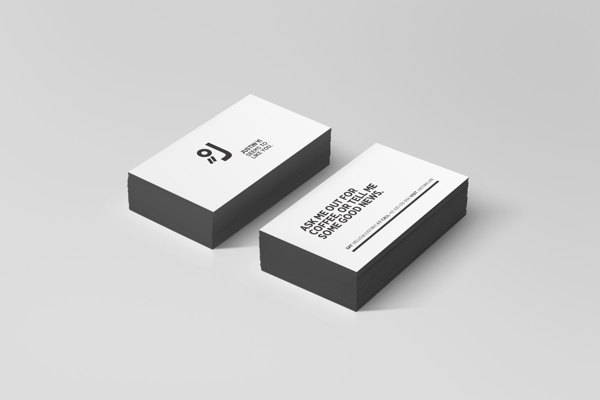
Self Promotion Justin Yi by Justin Sang-Ki Yi
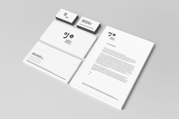
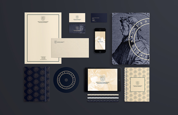
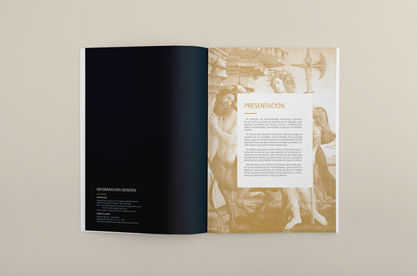
I. H. Francesco Petrarca by Ana V. Francés
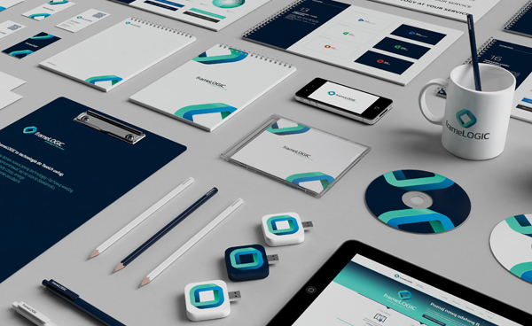
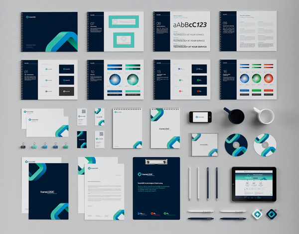
frameLOGIC Rebranding by Necon
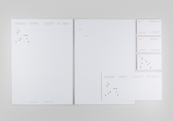
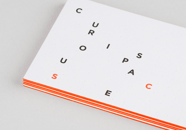
Curious Space Identity by Mash Creative
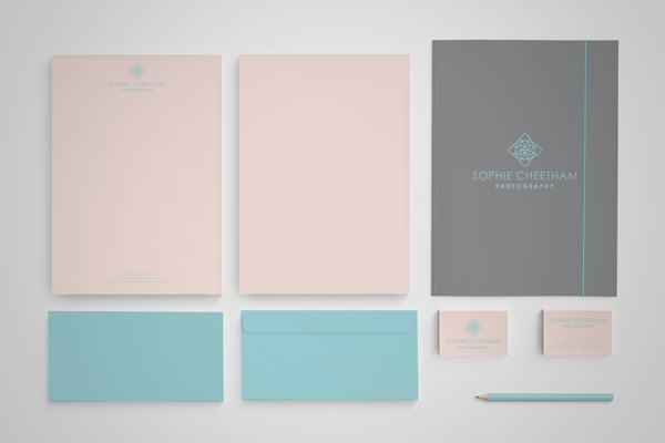
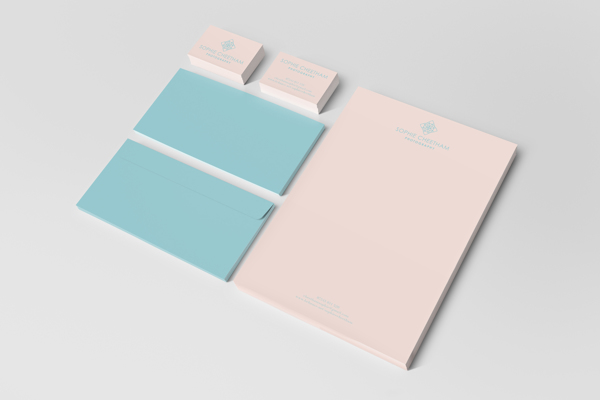
Sophie Cheetham Photography by Alan Cheetham
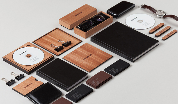
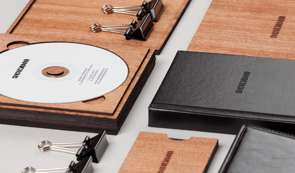
Eskimo Identity by Pavel Emelyanov
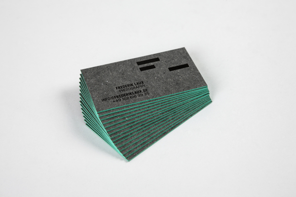
Frederik Laux Photography by Christian Vögtlin
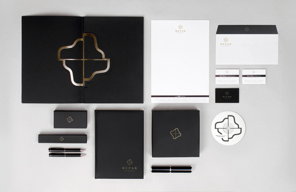
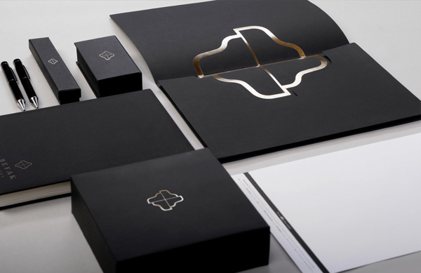
Befak Identity by Christian Vögtlin
Author Bio
Andra Postolache is the PR and Editor of Pixel77 and Designious. She enjoys a great vector pack, design tutorials, articles about Marketing and animal prints. Get in touch with her on Twitter and Google+.












1 thought on “20 Beautiful Stationery Branding Mockups”
Amazing !!