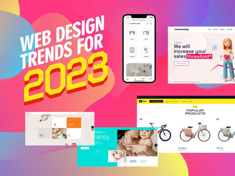
Web design trends come into being in response to peoples’ needs. As those needs change the marketplace adjusts and new design trends come into play. 2022 is no different.
At the present time the mood is one of trying to cope in a world that seems to have become more chaotic and less predictable than usual, due in large part to the Covid pandemic.
The 5 trends we will be looking at in this post indicate a desire to bring a sense of balance by replacing unpredictability with order, and boldness with subtlety and even a touch of humor.
We will be using BeTheme pre-built sites to illustrate these new design trends. You can use these pre-built sites for inspiration or implement them directly as you create or redesign sites for your clients.
5 Web Design Trends to Use in 2022
What you will notice while working your way through these examples is that these 5 trends have something in common. They each in their own way serve to lend clients a helping hand by making it easier for them to engage visitors and lend the visitors a helping hand by guiding them to important information.
These are the 5 new web design trends:
1. Immersive image design can inspire consumers to do more in 2022
This is happening everywhere around the globe. A significant portion of this interaction with the digital world is for entertainment, attending to business, or engaging with another person.
The rest of the time is spent seeking information that relate to what goes on outside of their screens; shopping for a product or a seeking a real world experience being two examples.
If you have a website that promotes either, the most effective way to make a sale is to let your visitor “feel” it.
That’s reasonably straightforward if you are selling a product. You can zoom in on it to show greater detail, display it from different angles, show different colors, or display other options.
But how do you help your visitor “feel” an experience? This is where immersive design enters into the picture by creating digital environments that give the visitor a sense of real world realism and a consequent sense of feel.
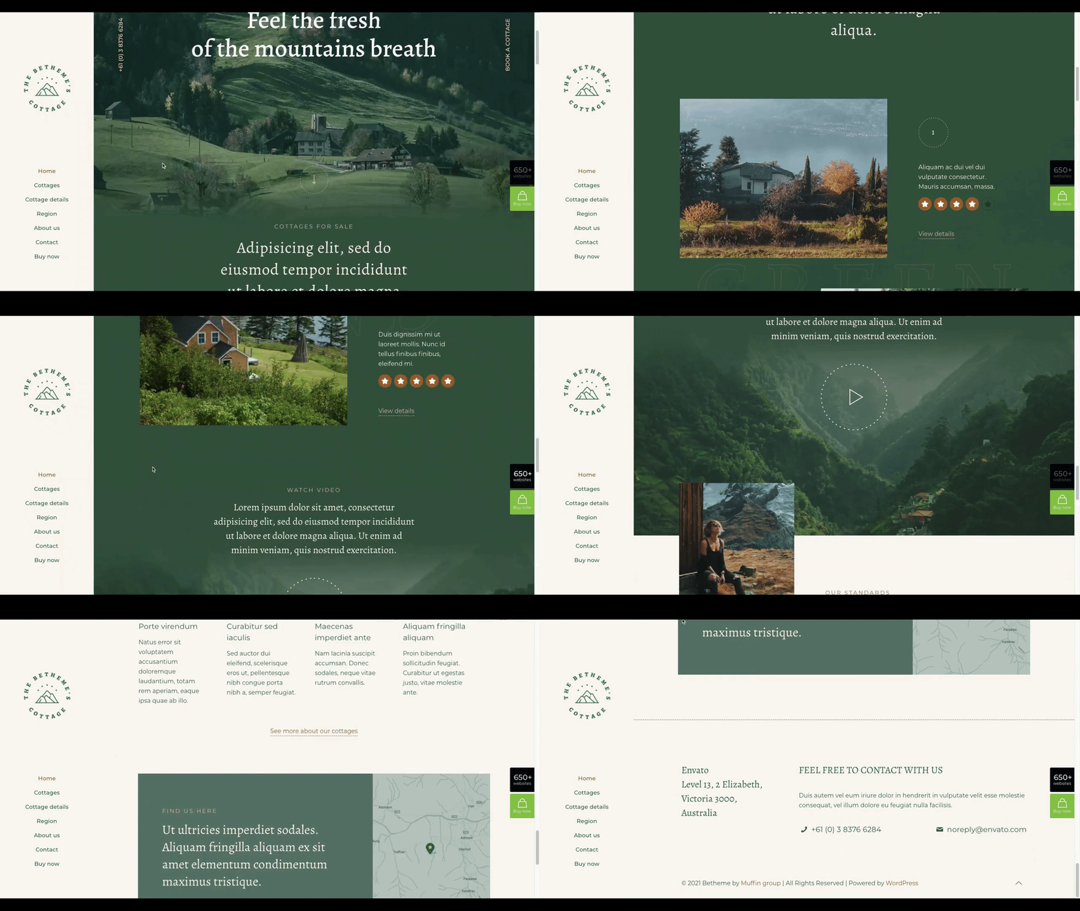
Many of BeTheme’s ore-built websites are designed to do exactly that. Take for example BeCottage2 with its use of an image filter and a blurring effect to blend the landscape images in with the digital content.
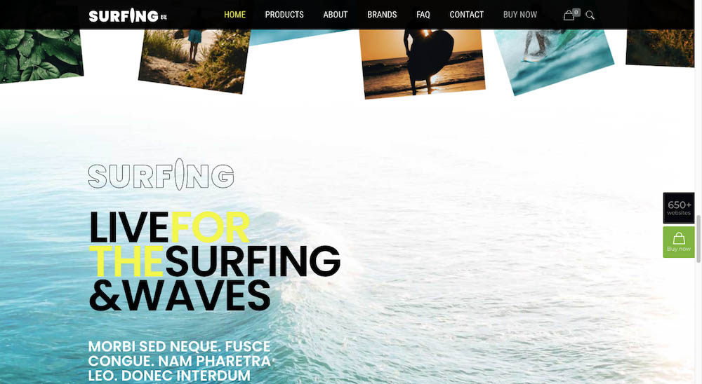
Surfing2 takes a similar approach. In this pre-built website design the lighter area in the ocean’s image blends seamlessly into the website page’s background.
Instead of jerking from one section to the next the viewer experiences a seamless transition from the digital content to the natural setting.
2. Changing typography is utilized to spotlight content
Designers use everything from bold, brash changes in color and size of typography to more subtle changes in style to attract visitors’ attention. Even a small change in font size or the use of italics will be noticed.
Applying motion to text can also have a pronounced effect. Moving text can be so effective in fact that you should take care not to overdo it. Viewers are not likely to look upon movement of excessive amounts of text as being particularly helpful.
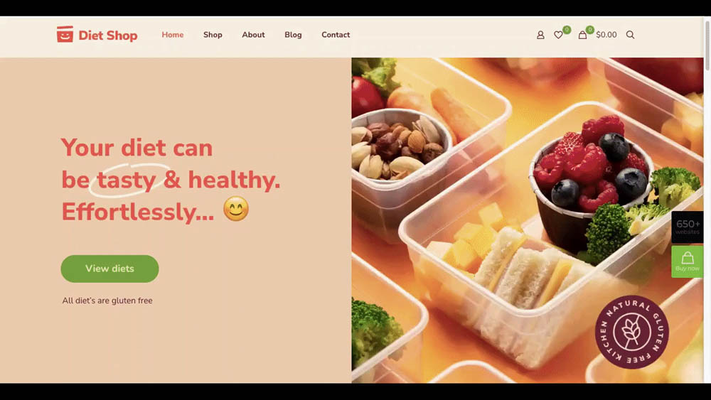
Changing typograph is most effective when motion is applied to key pieces and only key pieces of content as is done in this BeDietShop hero image:
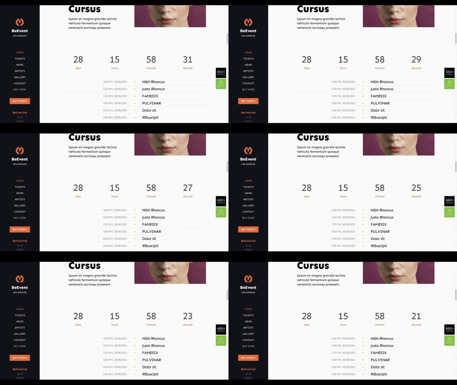
BeEvent7 uses a simulated ticking motion of a clock as its attention-getting approach.
There are plenty of things that can be done with motion. It can be fast or slow, counting down or counting up, or even random should the overall context call for it.
3. Line art backgrounds can function as helpful guides
If there’s any aspect of web design that seems to be in a constant state of change it is background design. Recently we’ve gone from dark-mode color schemes, to video sliders, to the use of dramatic gradients, each of which can require a healthy dose of creativity.
2022 introduces the use of line art to background design, an approach that not only can be used to create visual interest but can be used to provide visitors with guidance as well.
Line art does not imply the use of arrowheads or pointing fingers to offer guidance. Abstract designs can be every bit as effective and are also much more fun to work with.
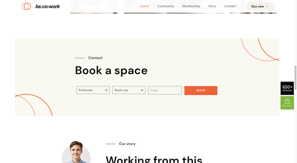
The BeCoworking pre-built site offers an unpretentious yet effective example:
The circles in the two corners serve two purposes; (1) they attract viewers’ attention as they move down the page and (2), their inward curve subtly turns the focus to the booking form in the center.
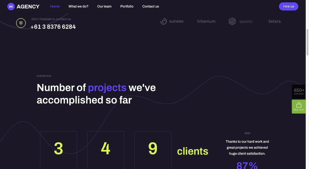
BeAgency6 also makes effective use of line art backgrounds:
While the nebulous shapes initially seem to be there for decorative purposes only, they play a key role in guiding visitors throughout the content.
When you take into account how many ways there are for people’s eyes to scan across a page, using a simple approach like this one to keep visitors focused on the right parts makes sense.
4. Interactive graphics provide more context for users
Do it right and you will get more and more visitors to engage and more and more to convert. While it can be difficult to find a surefire approach to getting visitors to engage, one web design that has proven time and again to work is to use interactive design elements.
If a button appears to be begging to be clicked, a visitor will be tempted to do so. If it is simply a flat shape on a flat surface that visitor may take a moment to think twice.
As can be the case with any design trend, having too much of a good thing can backfire. Too many interactive elements could easily lead a visitor to a place other than where you want him or her to go.
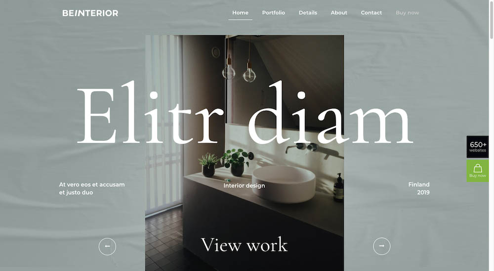
An example of an effective way to use interactive graphics would be to take what would otherwise be scrollable content and convert it into a slideshow experience; like BeInterior6 has done at the top of its home page:
Scrolling has become so common that you may want to give some thought as to keep it under control so visitors don’t run past content you want them to see. One way is to let the visitor engage interactively with important content.
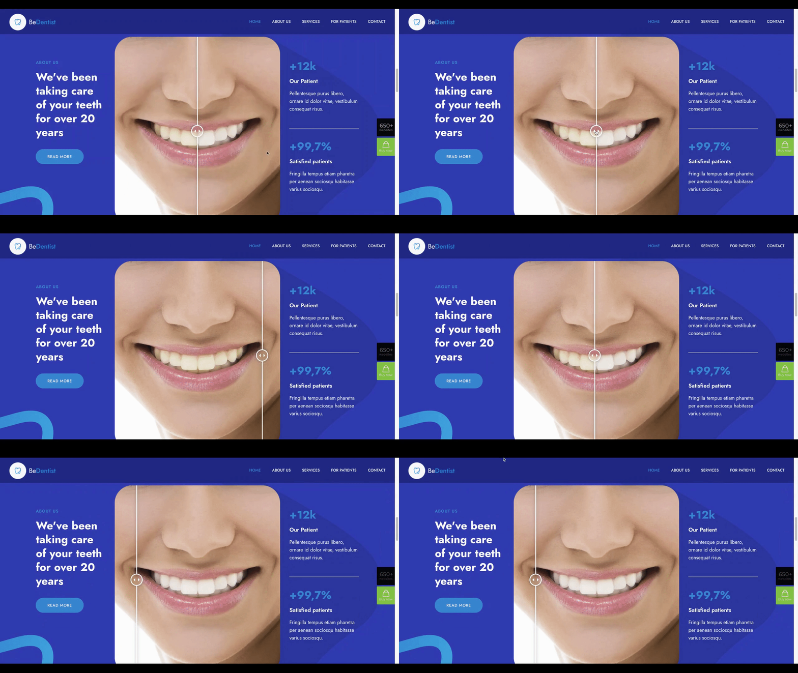
The Before/After on the BeDentist4 site show how this can be done.
This approach is a lot more fun to design and a lot more fun for a visitor to interact with than the use of side-by-side Before and After examples.
5. Use positive color palettes to send the right vibes to visitors
We can define a positive color palette as one that brings a desired emotion to the surface and encourages a visitor to click or convert.
There are several things about colors that draw out emotions. Green is usually thought of as restful or peaceful, red may call us to action (not always a good thing), while a splash of yellow can elicit a happy feeling.
You sometimes need to take what is happening in the world, or in your business niche, when choosing a color palette that will be pleasing to your customers. A subdued palette can usually be used throughout a website, while bold colors, even when effective, should be used sparingly. Splashes of yellow on every page probably won’t make visitors happier and happier as they proceed through your site.
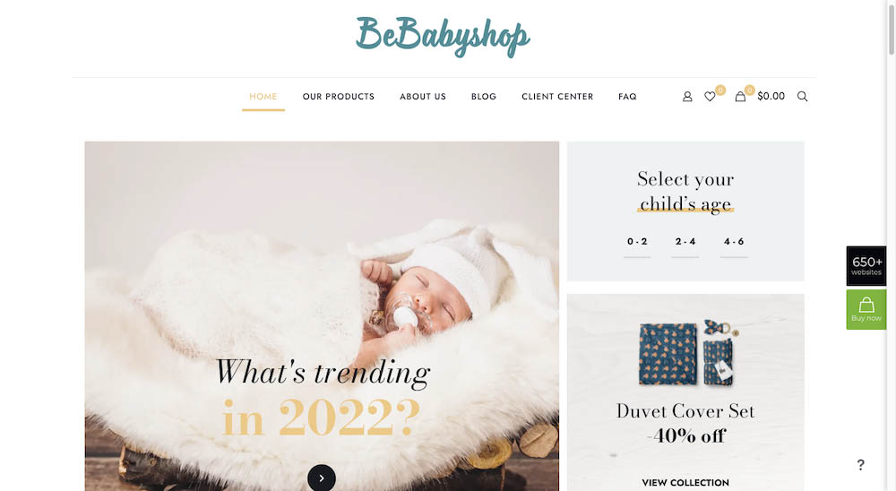
Creating a gentler experience can be an extremely effective approach. Note how this is done in the BeBabyShop pre-build website with its focus on a variety of soft tone backgrounds surrounding the products:
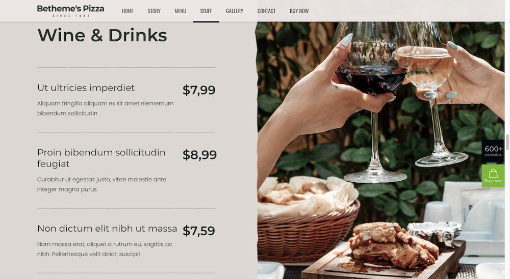
The BePizza5 site also uses softer tones to create a casual, relaxing atmosphere.
These are not the bold, contrasting colors that are so often associated with restaurant website design, where an emphasis is on fresh vegetables and mouthwatering servings.
Keep up with the times with a little help from BeTheme
Having seen what these new design trends involve, you hopefully will not stress out trying to figure out how to put them into practice.
BeTheme has removed any need for discomfort or uncertainty. Its pre-built sites are designed with the latest design trends in mind, and they can easily be repurposed if trends should change.
BeTheme gives you the total WordPress web design solution with its 3 different builders and 650+ professional-grade pre-built websites. You can use them to quickly and cost-effectively build customized sites for your clients – using the latest design trends.










1 thought on “5 Cool Web Design Trends for 2022 That Your Clients will Love”
Thank you for this. We actually needed some insights on some new designs.