When thinking about where the web design industry is heading, we often wonder where the future will take us. Are we looking at more automatic work and getting rid of the human component? That seems unlikely, since the actual process of design requires creativity, an eye for aesthetics and other human traits that AI, try as hard as it might, will never be able to fully imitate.
What is possible, though - almost certain, really - is that for the humans doing the work, it’s going to get easier and easier. Already we are seeing a few platforms that speed up processes and streamline work.
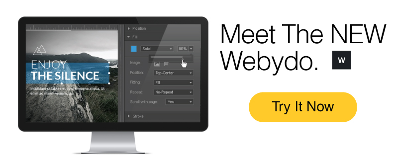
One of the most prominent names in the industry is Webydo, and most recently - the NEW Webydo, with a serious revamp. Webydo has always been all about professional designers; this is its credo. With the new version this is even more apparent. The platform was clearly designed with designers’ needs in mind.
So what does this 2.0 bring to the table?
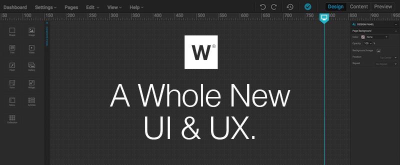
1. A revamped user interface & user experience
The New Webydo has a whole new UX & UI to it. The system is very easy to use and friendly, with a familial and intuitive feel to it. You’ll find, as you’re working on it, that many useful tools are all a click away, and that the most useful ones are highlighted. There’s something very streamlined about the process the new UI, UX create. The interface is extremely well designed and brings forward all the most useful tools so they’re always just a quick click away. All in all this is clearly a product that’s clearly been made for designers, by designers.
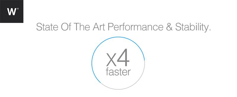
2. Stronger performance
The innovation here is not only above surface but under it too: the whole infrastructure got a big boost and the results you will be able to sense immediately. Webydo 2.0 works faster, smoother, and has no disruptive bugs. You can work on it as fast as you’d like and never have to worry about things getting stuck or not being stable enough.
3. Not a one trick pony - A full design workflow
The nice thing about having a strong platform to work on is that it makes all other tools unnecessary. With Webydo you’ll see that you don’t need to use different tools & platforms to go from prototyping to designing , creating, managing and publishing; instead you can do it all with Webydo. You can even host the sites there and manage multiple client sites at once from the dashboard, which is a hugely helpful shortcut for professional designers.
4. A new look
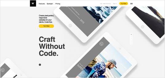
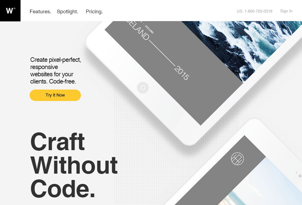
Not only the tools themselves but Webydo’s website, too, has been remade. The task was handed over to the team at Hello Monday, an award-winning digital creative agency. They truly put the time and effort into this one. Everything looks super cool and slick, the whole site shines, and certainly is extremely inviting.
5. New themes
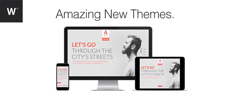
Then there are the themes. Not many people give them enough credit, but ready-for-use themes are a very important part of a design platform. They’re often the jumping point for a project, and their quality - both in the thought put to make them as well as in the final look, color schemes, ordering etc - can make a good website great. Here you’ve got an all new collection with plenty of brilliant themes to choose from for any purpose, including parallax scrolling, flat design, split screen layout, black layout and fullscreen video background.
However, you can always choose to start designing your clients’ sites by starting from a blank canvas or by choosing Webydo’s Layouts option – so you’re never limited to the themes only.
So here’s the bottom line: if no-coding design is something you’re interested in, whether you’re already trying it out or just considering it as a way to save time, effort and money for your business, Webydo 2.0 is a really great option for you. It contains everything you need for your work and is fun to look at and use. And what more could you possibly need?


