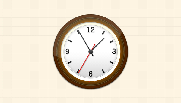
Friends, in today’s tutorial I will show you how to create a pretty nice wall clock in Photoshop. At the end of this tutorial, you can download the PSD file of the tutorial along with the wall clock icons in sizes 512x512 and 256x256 pixels. Pretty nice, huh!
Step 1
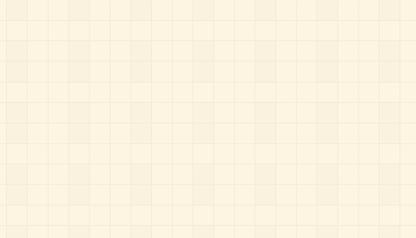
Let’s first create the background i.e. the wall for the wall-clock. Open up a new PSD document, size 1400 x 800 pixels and add a new layer (Ctrl+Shift+N) with background color # fdf4e2. I have applied a custom-made tiled pattern to the layer and you can download it here. While applying the pattern, I reduced the Pattern Overlay opacity to 10% to make it look subtle. You can also play with your own different patterns for the wall. Here’s the result of my wall (background).
Step 2
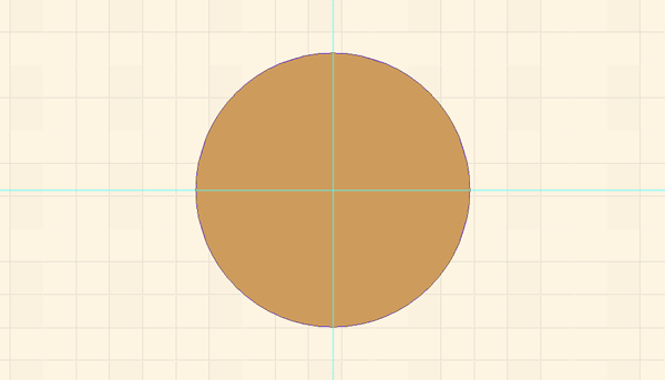
With the help of Rulers (Ctrl+R) I have set Guidelines for reference points vertically on 700 pixels and horizontally on 400 pixels. In other words the guidelines will help identify the center of the document and make it easy to organize all the layers. Now click Ellipse Tool (U) and set option to Shape Layers (under the top menu) and draw a circle as shown below.
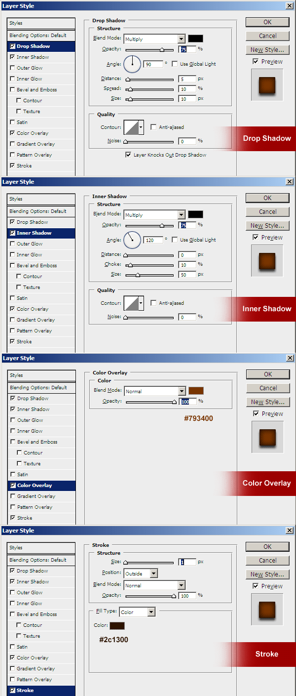
Apply the following layer styles from the Blending Options to the circle layer.
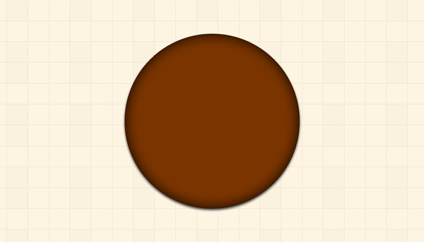
The following is the result I have got after applying the above layer styles.
Step 3
Now duplicate the layer (Ctrl+J), and with the help of Transform tool (Ctrl+T) reduce the circle size by 10 pixels from the Vertical Scales (90%). Maintain aspect ratio by clicking the Link icon. Or you can draw a new circle using the Ellipse Tool (U). Apply the following layer styles from the Blending Options to the circle.
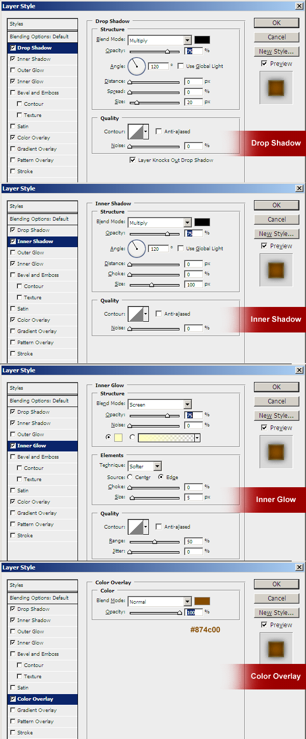
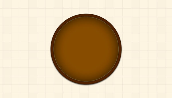
The following is the result I have got after applying the above layer styles.
Step 4
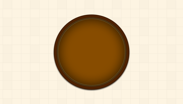
Now duplicate the layer (Ctrl+J), and with the help of Transform tool (Ctrl+T) reduce the circle size by 3 pixels from the Vertical Scales (97%). Maintain aspect ratio by clicking the Link icon. Or you can draw a new circle using the Ellipse Tool (U). Do not change the layer styles.
The following is the result I have got after duplicating the layer.
Step 5
Duplicate the layer (Ctrl+J), and with the help of Transform tool (Ctrl+T) reduce the circle size by 10 pixels from the Vertical Scales (90%). Maintain aspect ratio by clicking the Link icon. Or you can draw a new circle using the Ellipse Tool (U). Now change the layer styles as follows.
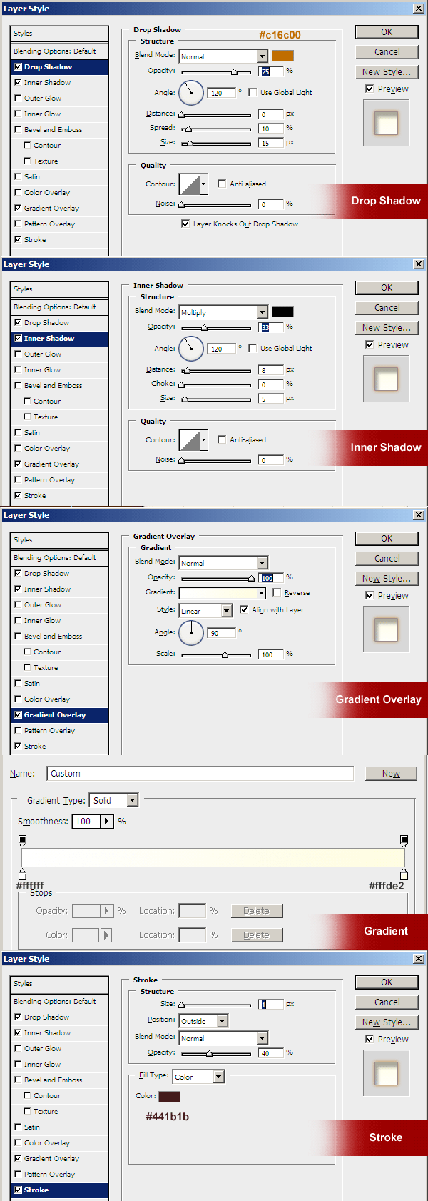
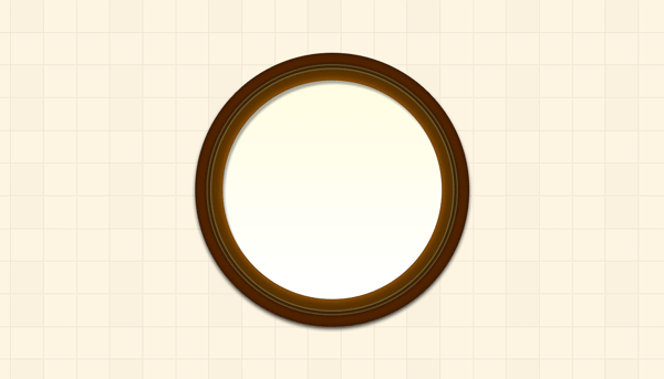
Now that the dial plate is created, here’s what I got so far.
Step 6
Duplicate the dial layer (Ctrl+J), and with the help of Transform tool (Ctrl+T) reduce the circle size by 3 pixels from the Vertical Scales (97%). Maintain aspect ratio by clicking the Link icon. Or you can draw a new circle using the Ellipse Tool (U). Now change the layer styles as follows.
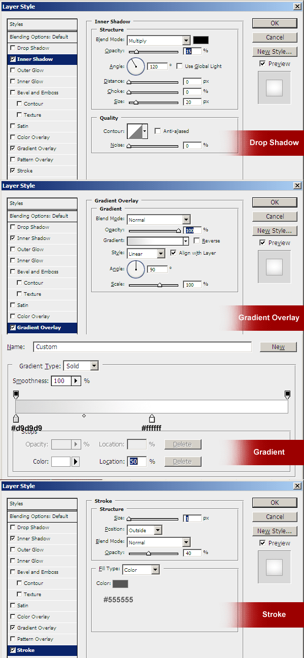
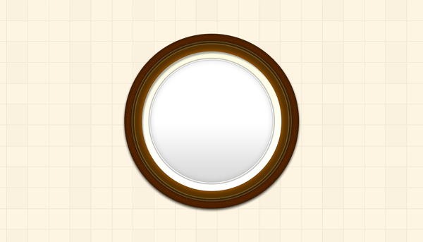
The following is the result I have got after applying the above layer effects.
Step 7
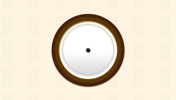
Now create a knob in the center of the clock from where all the 3 thorns rotate. Draw a new shape circle using the Ellipse Tool (U). Apply the layer styles as follows.
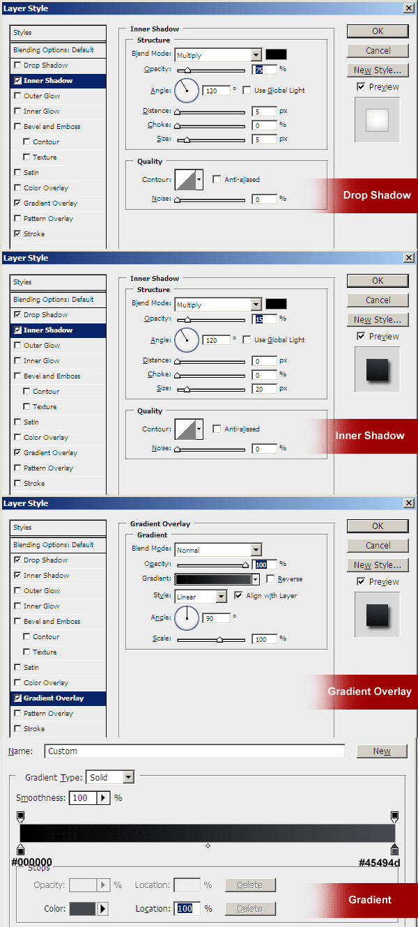
The following is the result I have got after applying the above layer effects.
Step 8
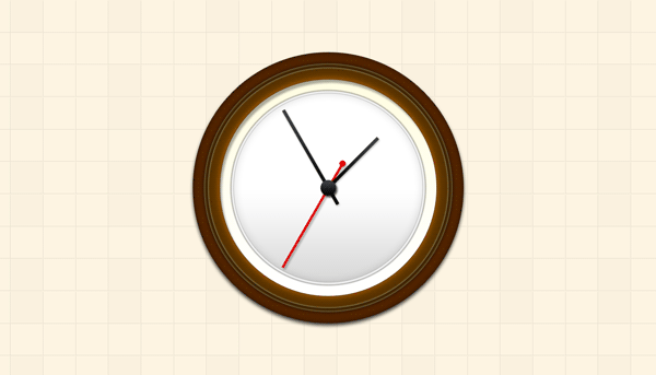
Now it’s time to create thorns. Draw two new thin rectangles in Shape Layer using the Rectangle Tool (U) – one a little long for minutes and the other one small for hours. Apply the same layer styles as in Step 7 and rotate the thorns using Transform Tool (Ctrl+T) and the Reference Point Location. Now draw red thorn for seconds and apply Color Overlay to Red and Drop Shadow same as the other thorns. Here’s what I got.
Step 9
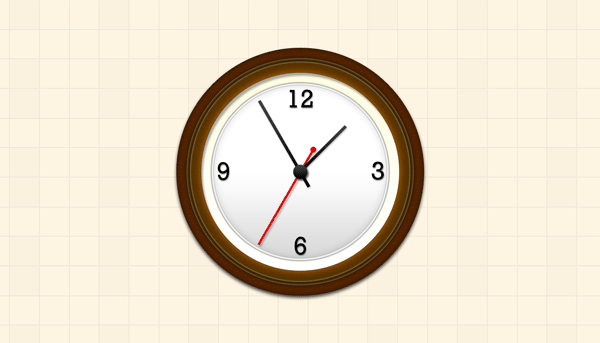
Using Text Tool, write 12, 3, 6 and 9 in dark or black color as the main hours showing on the dial plate. I have used Rockwell font and size 60 points. Apply Drop Shadow same as added for the thorns. Place the numbers as shown below.
Step 10
Now for other numbers (hours), I have used 8 small rectangle shapes. I have copied the Layer Effects of the dark thorns and applied them on these 8 shape layers. I have adjusted each shape in a circular way so all the numbers and shapes look 12 hours of the clock.
Here’s the result I have achieved.

Step 11
Now let’s add some gloss to it. Draw a bigger oval shape on top of all the layers. Rotate it a bit to the left. Set the color to white as shown below. To hide the extra parts of the oval, select the oval shape layer, hold Ctrl key and click the very bottom circle shape layer. While the selection shows up, go to Layer > Layer Mask > Reveal Selection, and the extra parts of the oval are hidden. See screenshot below.
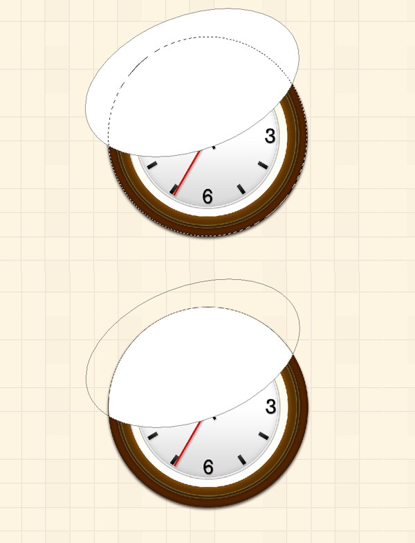
Now reduce the master opacity of the oval shape layer to 15%, and here’s the final result I have achieved.
Author: Rafi
File Resolution: 1400×400 pixels,
Icon sizes: 512x512, 256x256 pixels
File Format: PSD & PNG
Keywords: wall clock tutorial, icon design tutorials, Photoshop Tutorials, psd icons
Size: 0.56 MB (zip







6 thoughts on “Create a pretty nice wall clock in Photoshop”
Awesome work! Thanks for all the useful and beautiful creations Rafi!!!!!!!!!
Merci pour le partage!
Thanks for this effort and with this i learned what is photoshop
to just see web site what contents i have seen on web site it is to to to good for who is interesting to learn new things thank you very much i am very happy to see contents on web site.
Ah! Why didn’t I think of that for the clock’s “shine”
Thanks for sharing!
Thanks for this step by step process. I am glad you shared your knowledge in Photoshop. I have been learning a lot of stuff from the internet and your blog’s really helpful. Good job!