The Internet business sector has grown by leaps and bounds over the past ten years. Approximately 1.2 million Internet-related jobs have been created over the past decade, with nearly half of them involving website designers and developers, and owners and employees of eCommerce and supporting businesses.
Like speakers and writers, web designers need to know and understand their audience to get things right. They also need to understand how to reach out to that audience; and that can be a challenge.
Web designers, and their clients, need to understand and focus on providing excellent user experience (UX) if they hope to keep customers satisfied and turn them into repeat customers. This can at times seem daunting, but by using the right tools, the challenge can be met.
What is it that makes the challenge so daunting?
A website designer’s goal is to satisfy the client, and eCommerce websites are generally designed with the client’s business objectives in mind. The business objectives of the average Internet user must also be taken into account, however. If this is not done, or done poorly, there is little guarantee of success.
What makes UX design such a challenge in 2016?
- You are dealing with people who are often highly hedonistic.
- You are dealing with people looking for instant gratification.
- The typical Internet user has an attention span of a few seconds; not a few minutes.
- Internet users can be an impatient lot. When a page takes more than 2 seconds to load, they get uncomfortable; 3+ seconds, and they are apt to go elsewhere.
These are the problems website designers face. They need to understand what UX involves, and they need modern tools to assist them in creating websites that will keep users engaged.
Modern Look and Feel keeps users engaged, but just what is it?
Knowing what is significant to users in terms of the information being presented to them is important. Knowing the best way to present that information is equally, if not more, important. Presenting information in a way that will engage a user, keep that person interested, and coax him or her into heeding a call to action is what modern look and feel is all about.
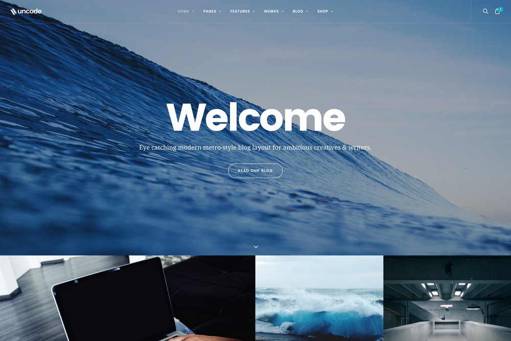
Image Source: Uncode WordPress Theme - Blog Metro layout
The Shortcomings of Classic Website Design – Websites are all too often designed as if they were to be read like a book. Users rarely do that. Users would rather scan than scroll. They don’t often read from left to right, a line at a time. They skip around to elements on a page that attracts or interests them. The scan until they find what they are looking for. Modular design makes it easy for them to do what they like to do best – scan.
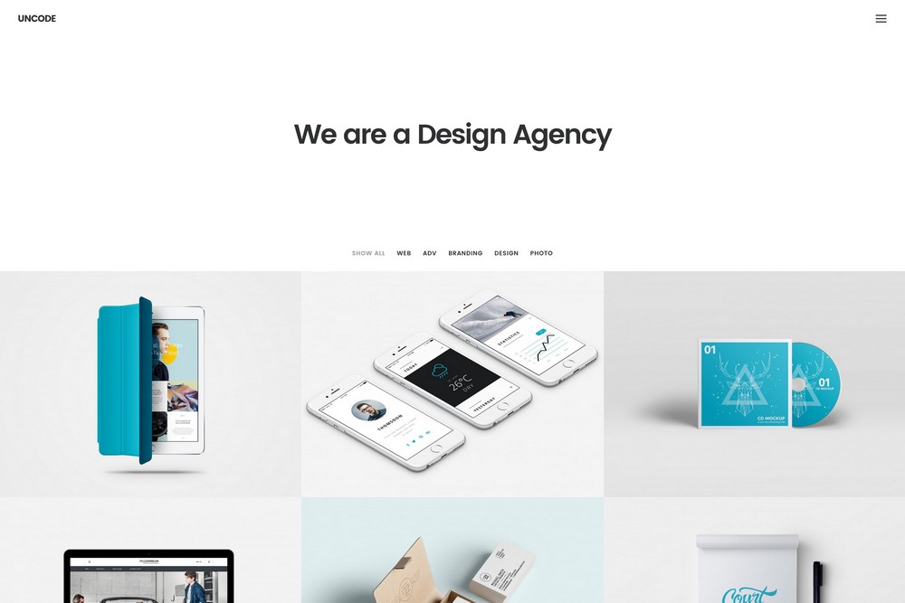
The Virtues of White Space – White space makes viewing easier. Spacing and margins can make key design elements, an image of a product for example, stand out. If could even be said that while white space says nothing, it can speak volumes. White space is a powerful tool to use when presenting information. It helps users lock on to what you want them to see.
Image Source: Uncode WordPress Theme – Portfolio Agency Layout
Touch and Feel, and the Importance of Images – Online shoppers can’t touch and feel merchandise. Today’s technology doesn’t allow for that. Crisp and clear images, and well thought out images, can make all the difference however when it comes to giving shoppers the information they are looking for. This is especially true for the mobile shopping crowd with their tiny screens that seem to be getting smaller and smaller. Giving these shoppers what they need requires, among other things, using the most up-to-date design tools and techniques.
Which leads us to a solution to the UX problem.
An Innovative Solution to the UX Challenge
Knowing the UX challenges, and understanding what the characteristics of a website need to be to overcome those challenges, led to a new ThemeForest product, Uncode. The innovative features that combine to make up this premium, multipurpose WordPress theme, offer website builders an ideal solution to meeting and surmounting the various UX challenges.
Because of this, Uncode, in spite of its relative newness, has gained a large and enthusiastic following. It has a number of features you will find in other premium themes, such as Visual Composer, WooCommerce, LayerSlider and Revolution Slider plugins, and Uncode is WPML Ready.
There are several reasons however why this theme stands head and shoulders above the rest, and why it is becoming the website builders tool of choice to confront UI and UX challenges:
It is the only theme based on a truly adaptive imaging system. It creates and delivers re-scaled versions of your images to match the dictates of the screen size and shape they are to be displayed on.
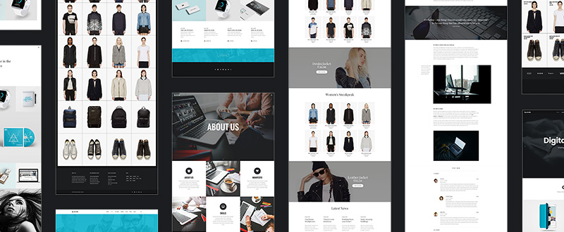
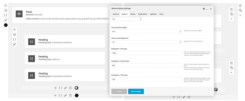
It features the most advanced adaptive grid system of any WordPress theme. Virtually any layout can be created, to any level of detail, a feature precise element positioning, spacing, padding, and gap settings.
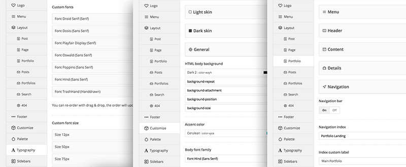
Uncode is flexible. Uncode’s fewer, yet more powerful modules give users additional design options. The variety of layout modes, including Masonry/Isotope options, are suitable for portfolios, blog posts, product pages, single media, and more.
Undsgn, Uncode, Simplicity, and Flexibility
When the Undsgn ThemeForest Elite Author team addressed the UX challenge, their focus was not only on the web designer, but on the website user as well. As a result, the web designer has in Uncode a theme characterized by ease of use, while at the same time offering greater flexibility. What the user experience are cleaner, more powerful, and beautiful websites.
Uncode has received more than its share of rewards. It has been a CSS Design Awards Site of the Day nominee, and a featured ThemeForest Top New File.
Uncode is quick to learn and easy to use. It is a tool a first-time web designer can master quickly. It gives beginning and professional web designers alike a robust solution to the eCommerce and UX challenges they face. It gives them the ability to produce websites that have strong user appeal.
Website owners naturally want sites that will draw in visitors, keep them engaged, and respond to calls for action. These visitors are more often than not impatient, they have short attention spans, and they are in a hurry to get on with their day. Find out here how using Uncode takes these user characteristics into account.















1 thought on “Design and UX Trends to Follow in 2016”
good article. a little clarifies