Much of what you’ve learned as a web designer you taught yourself, and one approach you’ve probably taken, is that of acquainting yourself with the latest and most modern web design trends. These UI and UX trends are popular with end users and clients alike, since they tend to make websites more engaging, and consequently drive up conversion rates.
Just as you do, whenever it is appropriate to do so. By doing so, they give you a head start in your efforts to produce websites that will captivate both users and clients.
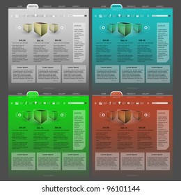
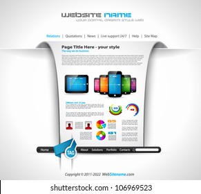
There are over 200 of these pre-built websites to choose from. Those shown here have an especially modern look, in that the professionals who designed them have taken into account one or more of the latest web design trends, including:
• an appreciation of visual hierarchy; an important web design principle.
• the use or subtle micro effects where they will have a UX impact.
• taking advantage of the visual power of hero images.
• using full-width layouts, and
• using patterns to focus on important messages.
How Be Theme Makes Use of These Trends in the Design of Pre-Built Websites
If you have come to believe that today’s websites tend to resemble one another, you’re not mistaken. Part of the reason this is happening is due to the need to accommodate mobile devices. That does not mean there is little room left for innovation—quite the opposite is true. Be Theme gives you plenty of opportunity to create fresh, modern, and unique websites.
Website design trends come and go. A few stick around – responsive, for example. Current trends that were in fashion a year ago include the use of long scroll and hero images. Each of the pre-designed website you see here incorporates one or more of the latest trends.
Although each website is in its own way unique, they all have several things in common. They take but one click to install, they are easy to customize, they require no coding to do so, and they make it easy for you to create websites that will attract and engage users and make your clients happy.
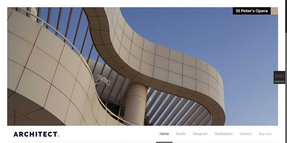
Be Architect2
This is obviously a modern pre-built website, but what design trends have been used to set it apart?
- For one thing, it features a minimalist approach.
- For another, its visual hierarchy scheme places the design elements in a proper relationship.
- The play on perspective gives the user an interesting, unique view.
Be SEO
Another modern website design; yet one whose style is quite different from the previous one.
- This is an example of using imagery to present a corporate identity in a friendly manner, as opposed to a more formal one.
- The use of warm neon vintage 80s colors positively contributes to the overall look and feel.
- An effective use of white space is found throughout, and the icon style fits nicely into the overall scheme.
- Good use is made of the popular card-like web trend.
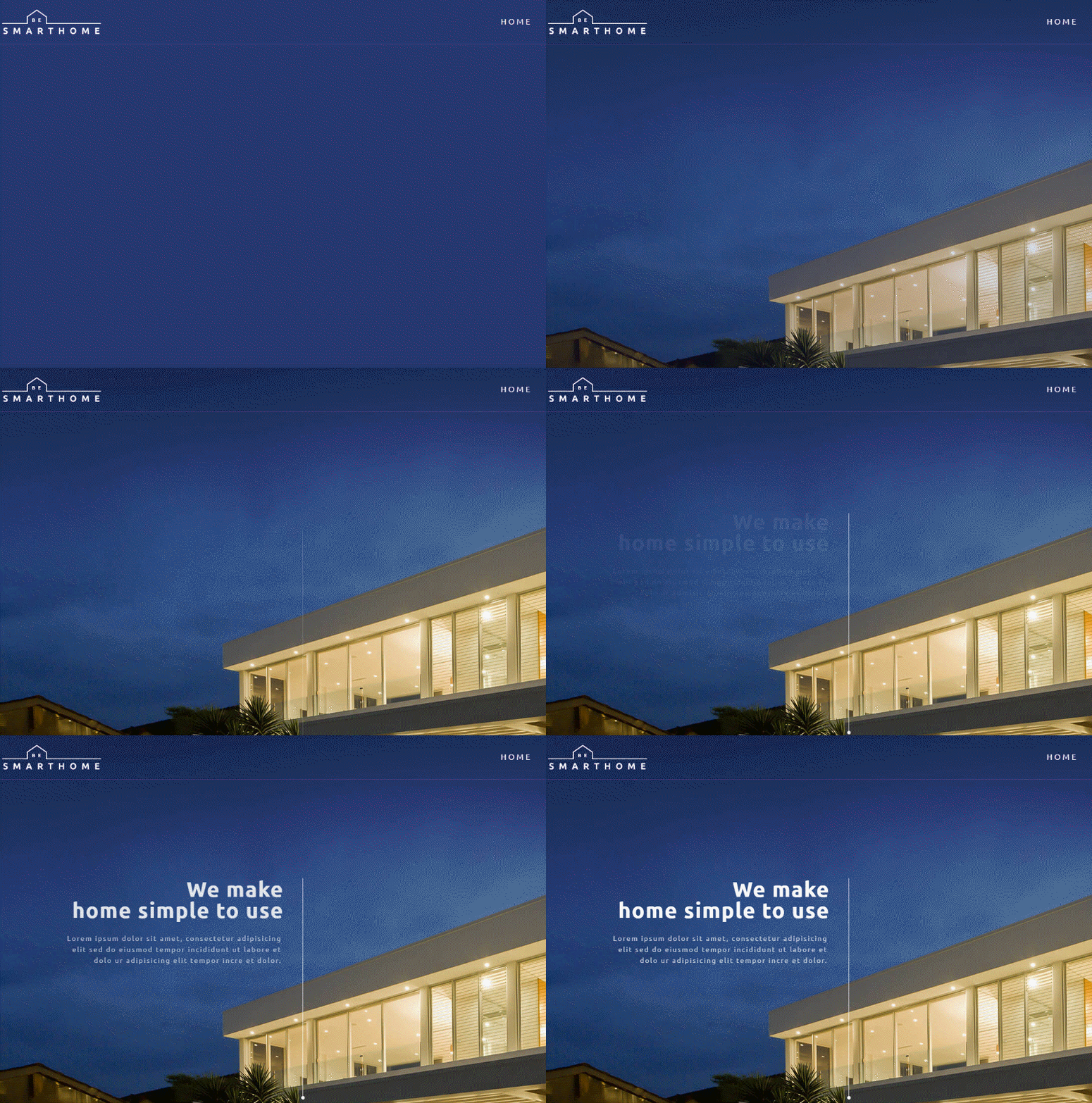
Be SmartHome
- Notice the subtle use of header effects. The needed information is there, but it is not allowed to interfere with the hero image.
- The design trends used in this website are consistent throughout, and nicely establish the conceptual relationship between the graphics and the site theme.
- An effectiveness of an interesting play with perspective can be seen in the pricing page.
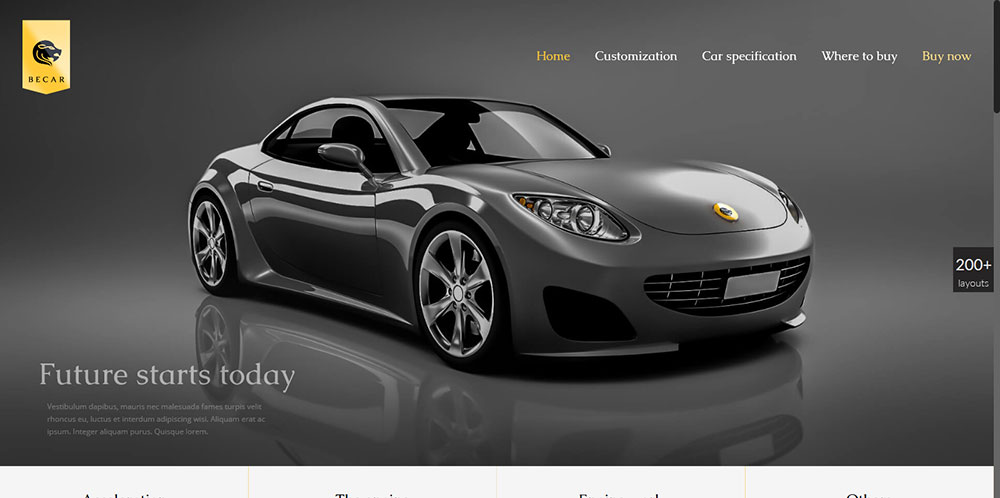
Be Car
- This powerful use of a hero image is a fitting introduction to the website’s message.
- The color scheme is extremely smooth and well organized, and fits in neatly with the careful use of white space.
- The gallery hover effects are designed to capture user attention as well as engage the user.
This design is a particularly good example of how several trends, the use of a hero image, and a tasteful color scheme/white space combination, all presented in a full-width layout, can combine to convey a sense of balance and elegance.
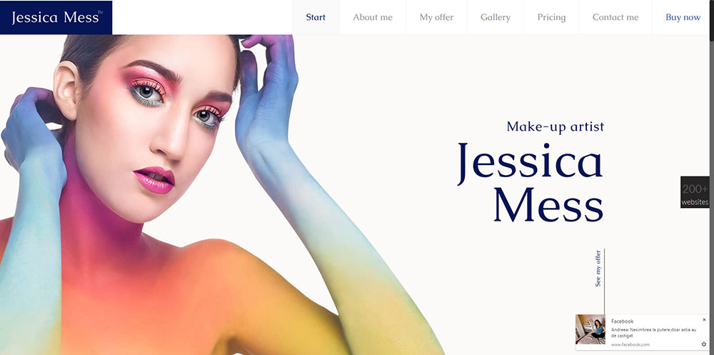
Be MakeUp
Be MakeUp is another example of how several design trends can effectively be put to use.
- The header effect is subtle, but not so much as to be inconspicuous. It does not distract from the main image, but the user is still aware of its presence.
- A clever use of minimalist icons points the user to information of interest.
- The hero shot effectively conveys the sites unique value proposition.
How Web Designers Profit by Using Pre-Built Websites
One word that best sums up how web designers benefit from using Be Theme pre-built websites could well be productivity. There are in fact many benefits, including ease of use, help in getting a project off to a quick start and enabling you to maintain that momentum, and making it possible to turn out one amazing website after another that provides an outstanding UX.
These benefits are due in part to the professionals who took into account the latest design trends while creating these websites. Every website type, and virtually every common website topic, is covered in Be’s 200+ selection.
Each pre-built website is fully customizable, so your design options are, for all practical purposes, unlimited.
Equality important are the 40 core features Be Theme brings to the table. These features include being able to install demos with a single click, the popular and powerful Muffin Builder and Muffin Options (Admin) Panel Duo, and the Shortcode Generator which helps you implement a wide range of useful website features without the necessity of coding.
Be Theme is in fact the biggest WordPress theme ever. Its huge user base is living proof that where web design tools are concerned, size matters.


