As a designer, you will work on myriad of websites. Some would be business-centric while some could be e-commerce. Some you might have to spend hours working on while some would be quick and hassle-free.
To create stunning websites, every single time, and irrespective of the niche it caters to, a designer needs a few resources up his sleeves. But first, let’s take a look at what makes a good website.
Design elements
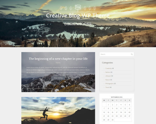
Duh! Goes without saying! But a superior web design is what separates the wheat from the chaff. Good design elements aren’t just resource-based. It has a lot to do with the designer’s own vision. From wireframing to getting the front end right, to the final execution; how a website turns out is secondary, how the designer sees it in the eyes of his mind is very important.
Skilled and seasoned designers understand the requirement of a website and knows what works best. If you are just stepping into this world, read up on what the pros have to say. How do they visualize a website to be, are there any tips and tricks they use? One important factor to consider is who are you making this website for. No, it’s not your client, but the people who will come to this website, who will click on the call to action button, and who will then keep coming back. How would they like the website to be, that’s the question you have to answer.
Aesthetics
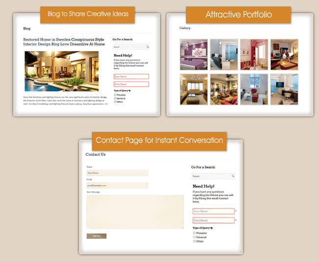
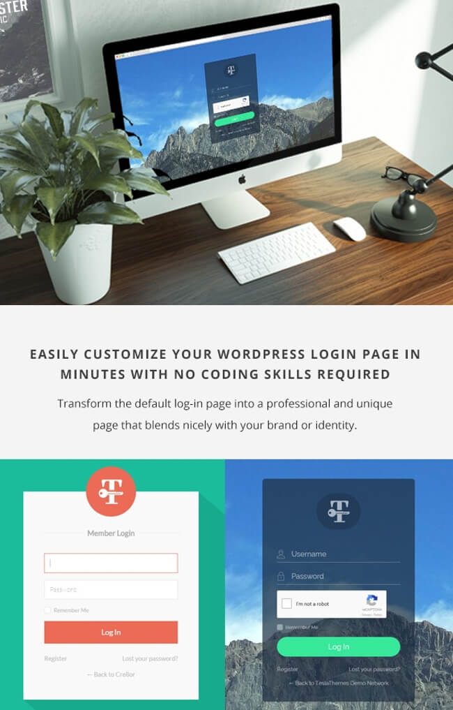
No one likes a boring website. Whether you are designing the main web page or the often-ignored login page, the idea is to make it fun and interesting. Think of ways you can add a visual element to your website, hiking up the appeal and aesthetics.
Should you put in more images? How about a gallery or maybe you should put up a video background? A beautiful de-cluttered website will prompt your visitors to stay on it for a while longer.
Themes are a great way to add a touch of beauty to your site. The specific ones, like, say for instance, you are working on a home remodelling business website. It’s such an uncommon niche that you’d have to work really hard building it from scratch. In this case, a theme would make your job easier as it is pre-built to suit the requirements of such a website. Blog-based themes to portfolio-based themes, you should pick one that complements the objective of your website.
Page speed
Seriously, it’s so frustrating when a website takes more than a few seconds to load. Gone are the days when people would wait for a good number of minutes for the page to load. If the competitor’s website load faster than your client’s website, then they’d lose business. Like big business.
Page speed is also a ranking factor, so designers should ensure that the elements they use do not cause the page to be sluggish.
Social media linking
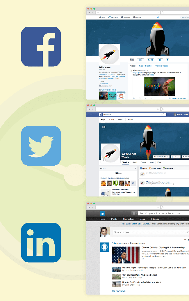
Today people are not just buying off your website but also directly from your social media pages. It is therefore, important to leverage the power of social media as much as you can. Besides optimizing each platform, you should also aim to connect your main website with each social media page.
A good way to do that is by using a social share plugin. These plugins make a webmaster’s life so much easier as it can directly share content from the website to the social media page (by giving the power to the webmaster as they can choose what sort of content should be shared/not shared). This also automates the process, so they don’t have to do anything manually.
Also, when it comes to social media pages, there should be constant branding through platforms. This means that if a customer comes to your website and then hops off to your social media pages, he should be instantly able to make the connection between the two. Besides being good for the website, it also helps in branding and marketing. One way to ensure this is by using the same colours and images (profile picture, background image etc.) across platforms.
Customer-centricity
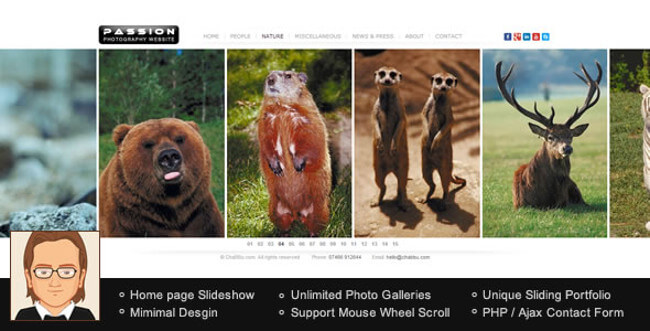
The end purpose of a website is to not just exist, but fulfil an objective – which in most cases is conversions. Think of websites as a showroom outlet in itself. This is where the customer is going to come, it’s the point of contact. Therefore, it has to be all about them.
Websites should be easy to navigate and user friendly. The end goal – for a designer – should be to heighten the user experience to as much as possible. Eventually, the user who lands on the website should not be frazzled by the technicalities or get lost in the layers. Make it simple, easy and convenient for him.
Good marketing strategy
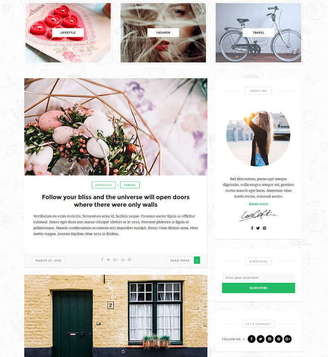
A website should automate the process of marketing to some extent. One way to do that is by sending out newsletters. Newsletters can be difficult, as it takes time to build up an e-mail list, demarcate subscribers according to the right category, write a stellar newsletter, and then market it. You can tell your client to do this manually or you can earn brownie points by suggesting a newsletter plugin that takes care of the process to a great extent.
Another good marketing strategy is to build curiosity. Suggest to your client that they should have a temporary ‘coming soon’ page up with a countdown timer counting down to the launch of the website. This not only informs prospective customers of when the website would be up but the timer builds up curiosity, prompting them to check back often.
A good website, no scratch that, a great website is important in today’s time when competition is rampant. One mistake and your client might lose out on good business. As a designer, you should ensure that the website you design are the best in the market, and for which you’d have to stock up on resources like themes and plugins. The more you have of these resources, the better and quicker you will get at your job. So start stocking today!
Author: Swati Gole
"Swati is a nature-freak, loves traveling and capturing unforgettable memories along the way. She loves singing and driving - often, both at the same time. Her favorite passtime is to hangout with her family and friends. She believes in work hard and party harder. Swati is responsible for updating DealFuel blogs - a daily deals site for web designers and developers with some really good deals and freebies."








1 thought on “What Makes a Good WordPress Website: 6 Things Every Website Designer Should Know”
Hi! Awesome post, really useful! Have you heard about Rawpixel? You’ve probably seen our images all over the place. We’re the leading stock photo contributor in the world. We’ve just launched our website where we give away the best free design resources out there. We’d be stoked if you could add us to this list. Check us out on www.rawpixel.com. Looking forward to you joining our community of creatives. BE INSPIRED. BE RAW. Nica