According to the U.S. Bureau of Labor Statistics, the number of employed web developers and designers will most likely increase by 13% from 2020 to 2030, which is faster than the average for all occupations.
So, if you ever thought of becoming a web designer, now’s the right time. And this is the right place to start.
In this article, we’re going to share fundamentals as well as tips from one of the best web design companies from New York to help you start learning web design.
But, before we dive in, let’s find out what web design is what it entails.
What is web design?
Web design refers to many different skills.
As a web designer, your job is to plan and create a website layout that offers the best user experience and aligns with your client’s wishes.
Many people seem to think that web designers are responsible for coding, but that’s not true. Web designers create the final look of the webpage in the form of an image file, whereas front-end developers translate that image into a code.
While some web designers choose to be freelancers, others prefer to work in the form of employment for software development companies, IT consultancies or other corporations. So, if your dream of working for that software development company in New York, your dream could come true.
Now that you know what web design is, it’s time we shared advice on how to learn it from the comfort of your home.

Source: Unsplash
Step No.1. Find a good source of information
One of the benefits of living in the 21st century is the possibility of using multiple sources for learning.
You can go the traditional way and learn about web design from books. You can read them online (some are even available for free) or get them from the nearest library.
If reading books is not your cup of tea, you can watch YouTube videos that cover web design topics.
Another great option is to attend an online course. That will help you persevere and stay focused on your goal. We also recommend you find some blogs and experts to follow. That way, you’ll be able to learn more from the experts and stay in the loop with the latest web design trends.
We’ve covered some topics you should get familiar with to start web designing, just to get you started.
Know the elements of visual design
The most basic elements of design are line, shape, negative space, volume, value, color, and texture. And if you look closely, any website you see online can be broken down into these components.
Lines can be straight, curvy, thick, or thin. They can be used to connect other website elements or words or keep them apart.
The principal geometric shapes include circles, squares, rectangles, and triangles. They are all widely used in web design, especially squares and rectangles, which can be used to organize the content of the page.
Circles are often used to showcase buttons, while warning triangles are often used to transmit important messages or alert users. Diamonds or rhombuses are not so popular but can if you’re creative, you can incorporate it well. For example, you create a diamond grid with each diamond showing a different picture or text leading to a different page on your website.

Knopp Biosciences’ website uses geometric elements for brand consistency & texture
Negative space represents blank areas between different website elements. You can use it to highlight a certain element and make it pop against the background.
Negative space also helps direct the flow of the page in a certain way, which comes in handy when deciding which design pattern to use on a site.
The two most common layouts are the Z-pattern and the F-pattern.
You’ll notice a Z-pattern on websites with a lot of negative space, void of too many words or images. Your eyes will go over the website left to right, top to bottom, forming an imaginary “Z” shape.
If users first read the top of the page (where the headline typically is) and the description below, and then start scanning the page from top to bottom until they reach something that catches their attention, they are reading in F-pattern.
Volume refers to the three-dimensional elements that have length, width, and depth. Even though three-dimensional shapes may not be that popular in web design, you can experiment with them and use them to create eye-appealing and interesting 3D projects.
The value of an element refers to the lightness as well as the darkness of colors. Using contrasting values can help you highlight specific website elements and make them stand out more than others.
Colors and different textures can also make certain elements of your site appear more exciting. Color theory is very much worth looking into. It represents a set of guidelines on color mixing and on creating pleasing and harmonious color combinations.
This knowledge is especially valuable because colors can be used to evoke the desired emotion or to give out a certain vibe and aesthetic. For example, red is normally associated with power and passion, while blue is associated with tranquility.
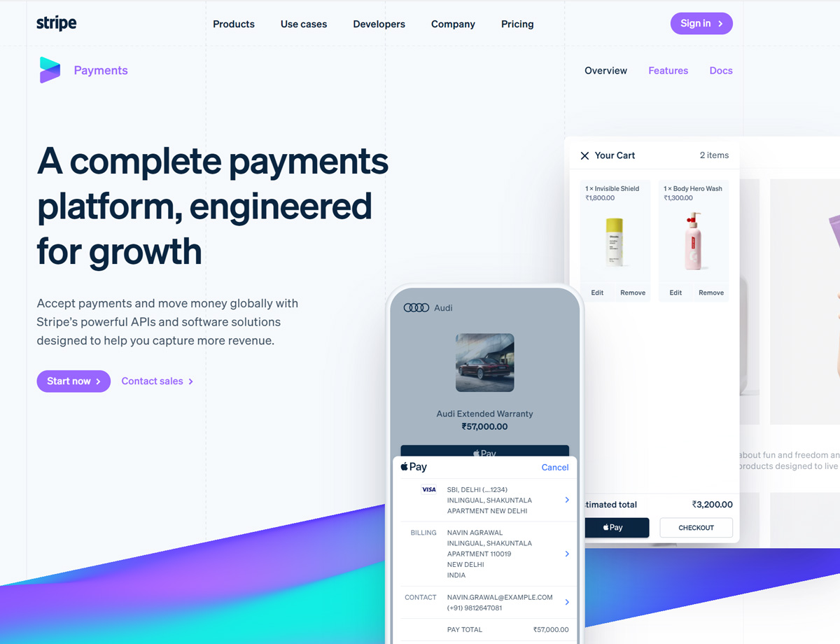
Stripe’s website uses vertical lines to create a grid effect and give the design texture
Learn the principles of design
Learning how to best combine key web design elements can help you create some astounding projects. We will share with you some of the most important principles you should stick to when designing your next website:
Unity and balance – this means that a website evokes a sense of harmony. To achieve this on your site, you need to group elements in a way that does not look chaotic.
Using grids could help you split your content and organize it into sensical, easy-on-the-eye parts. However, don’t forget to introduce at least some diversity that can spice things up a bit so that the webpage doesn’t seem boring.
Gestalt principle is used to describe the tendency of the human eye to perceive the sum of the parts differently than the individual elements.
Gestalt is perhaps most known for the gestalt school of psychology, but this phenomenon is also used in web designing. Basically, it means that you should group your website elements in a way that makes sense to users. Otherwise, you risk leaving your audience confused.
Hierarchy refers to expressing the importance of each element on a page and ranking them in the order you want your audience to view them. Size and color are most often used to accentuate elements and make them more noticeable.
For example, a large headline is guaranteed to attract more attention than the smaller one. Or, if you wish to highlight a call-to-action button, you can color it in brighter and attention-grabbing colors. Another way to emphasize the significance of an element is to put it at the top of the page.
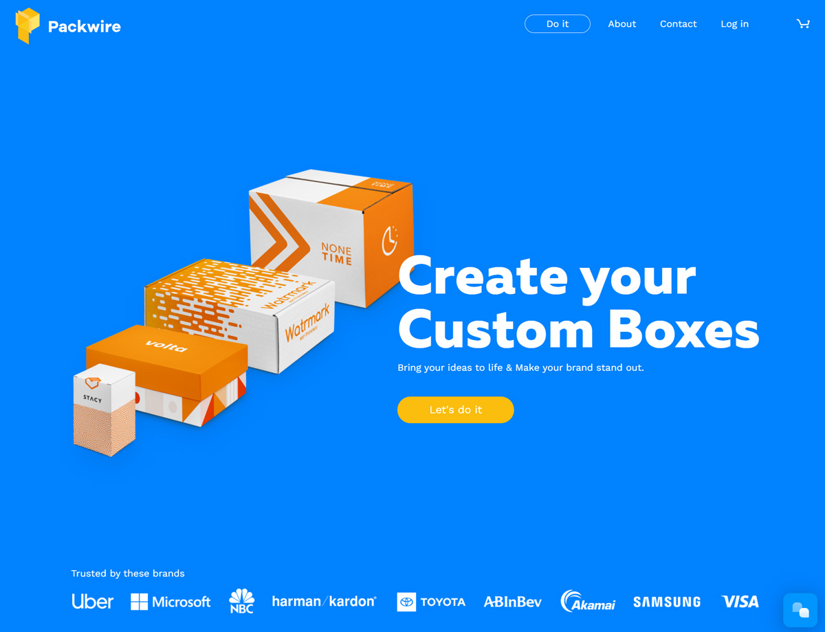
Packwire’s website is a great example of hierarchy & negative space in web design.
Pay attention to typography
Typography is a part of web designing dedicated to choosing the right style and appearance of text.
The readability of text depends on the typography. The font size, line length and height and background color are all part of the art of typography. Choosing a font size that is too small can strain the users’ eyes, as well as setting up line spacing to be too narrow.
Typography also allows you to invoke certain emotions. For instance, users often describe Serif fonts as practical and mature, while Script fonts as funny and casual.
Once you get comfortable with pre-designed fonts, you can start designing them on your own and use interesting and unique letters to draw attention to a desired part of the webpage
Step No. 2. Get familiar with the basics of HTML and CSS
Front-end development and web design are two completely different things, but to become a good web designer, you should understand some HTML and CSS basics.
Hypertext markup language (HTML) is the code running behind every single web page. It instructs browsers to display website content in a predefined way.
To determine the way your website will be showcased, you need to use tags. Each element has its own specific tag, including headings, subheadings, texts, links etc.
While HTML is the skeleton of a website, CSS is its skin. Cascading Style Sheet (CSS) is a language used to define the look and feel of your website. You can use it to manipulate the colors of your site, imagery, grids, spacings, and more.
Learn the principles of UI and UX
User interface (UI) is a part of the webpage that users interact with. UI design is focused on anticipating the users’ needs.
Two key principles of UI design involve an intuitive interface and simplicity.
The intuitive interface is the kind of interface that users understand easily and can use without thinking. To achieve this, you have to be consistent with using the same patterns. Stick to a simple interface or add short tips that are easily followed.
At last, see how users interact with the page and change things up if you see something is not working as you thought it would.
User experience (UX) is closely related to UI. It is usually defined as the overall feeling the user is left with after the interaction with the website.
A good UX means that users are successfully interacting with the website and leave the website feeling satisfied, and this is where the trusted web design company can help you. All that affects the conversion rate – the percentage of users that make the desired action, as well as the bounce rate – the percentage of users that leave the website without viewing other pages on the same website.
Don’t forget about SEO
Search engine optimization (SEO) is used to optimize the website’s content, technical configuration, and link popularity to improve its visibility and positioning on search engines. SEO and web design are interconnected because the content on your website is read by search engines.
You don’t have to become an SEO expert, but you should still understand how it works.
Many factors affect the positioning of the webpage, such as the quality of content, the speed of the website, HTML, bounce rate and others. To get you started, we’ll elaborate a bit on the use of keywords.
Keywords are the words that people type in the search engine. The keywords you choose should be tightly related to the audience you want to reach – your target audience. The ideal place to use them is in the title but bear in mind that you shouldn’t overstuff it. You can also put them in the meta description but be careful that they make sense and are not just randomly put there.
Step No. 3. Notice what you love about your favorite websites
The next time you visit your favorite website, look at it carefully. Why do you like it so much? Is the specific color combination drawing you in? Do you find the typography particularly appealing? Are the visuals enrapturing? Think of what fascinated you the most and make a mental note of it or write it down. Then, try to implement similar principles into your designs and make them just as appealing to your users.
Step No. 4. Make a wireframe
The first step to creating a website is creating its wireframe.
A wireframe is like an illustration of your website’s interface. It serves to help you plan the structure of your pages. It usually consists of two-dimensional lines, shapes, and arrows. In general, a wireframe is not supposed to be particularly intricate. It normally represents only essential elements you plan to feature on a page. That’s why many people refrain from using colors when creating wireframes. However, you can use hues to accentuate a certain part of a page. It will help you and your customer later when you get to web designing by providing a clearer picture of what you had in mind.
To create a wireframe, you can use a piece of paper or a wireframe tool. Many of them are available online, such as UXPin or Figma.
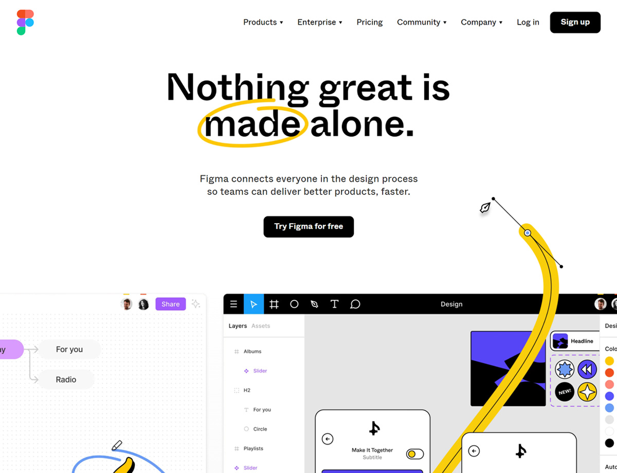
Figma is one of the top web design tools
Before diving into the HTML and CSS code, find a good website builder online. These offer pre-existing templates you can customize to your preference.
Now, this is just the start. These website builders can help you see the code that is running in the background and some even allow you to change it to your preference. If it’s your first time seeing the code, website builder can help you get familiar with the code and what it looks like.
Step No. 5. Start designing
The most important step on the journey of becoming a web designer is to start creating your first project.
You can read as many books as you like and complete a plethora of web design courses but putting that knowledge into practice is of utmost importance. You can start by creating a simple blog. Experiment with the colors, typography, layouts, and visuals. Don’t be afraid to make mistakes and don’t expect to immediately create flawless designs. Remember – practice makes perfect. You should be persistent and continuously work on improving your skills.
You can ask your friends what they think of your work. They could help you realize which blog areas need tweaking. Once you finish creating a blog, you could help your friend that owns a small business and ask them to create their website. They’ll surely appreciate it while you’re able to perfect your skills.
We also advise you to find a mentor that will help you on your journey of becoming a web designer. Don’t be shy about asking for help.
A mentor should be someone with experience that can give you advice and feedback. It should also be a person you admire since that will further motivate and inspire you on your path to becoming a web designer.
Now that you’ve read this guide, you have everything you need to start. So, start reading that book on web design that you have found. Play your online course. And don’t forget the last step of this guide – just start designing! After all, that’s what you aspire to do.




2 thoughts on “The Beginner’s Guide: How To Learn Web Design At Home”
Thanks. This helps everyone that has been thinking of starting something.
Great article – and especially great advice in the end: Start designing! I cannot stress this enough as well – many aspiring designers are caught up in learning information because they think if they will know that very last piece of information, they will be able to do something special. But in the end, it’s just tricky procrastination – the goal is always to design -> learn -> design. Really well-written guys 🙂