Insofar as new web design trends are concerned, 2018 promises to be one of the busiest years yet. Every trend seems to be screaming that adhering to it is a “must”.
Most designers enjoy the challenge of putting the latest trend into practice. Yet, attempting to do so when several are involved can create a sense of anxiety. There’s a voice that seems to say, “follow this standard, or you’ll be pushed down the competitive ladder”.
Luckily, there’s a WordPress theme that will help you maintain your sanity. BeTheme’s 330+ pre-built websites keep up with the times. They include the 8 stunning new trends incorporated in the following examples.
8 Creative Design Trends & How They are Put to Use
Design Trend #1: Illustration & Graphic Art
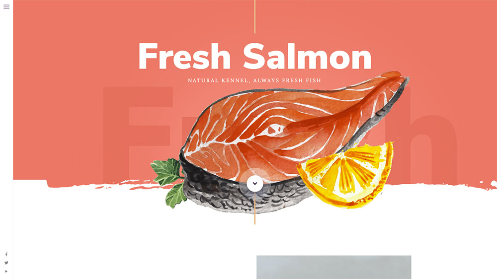
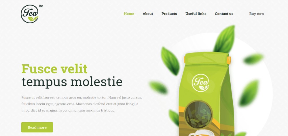
Custom art is big with web designers these days. A sub-trend, watercolor illustrations featuring a vintage look are especially popular. They bring with them a sense of relaxation and good times gone by.
BeSalmon
BeTea2
A bold font adds to the impact. They do so by attracting attention without distracting from the images. Serifs are back in favor too, so don’t be afraid to use them in the headline.
Design Trend #2: Light, Shadow & Smoke
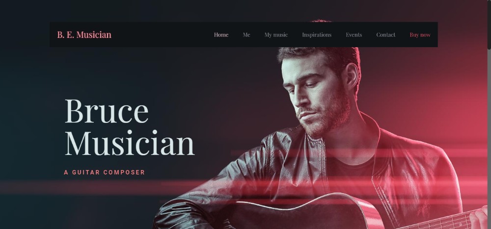
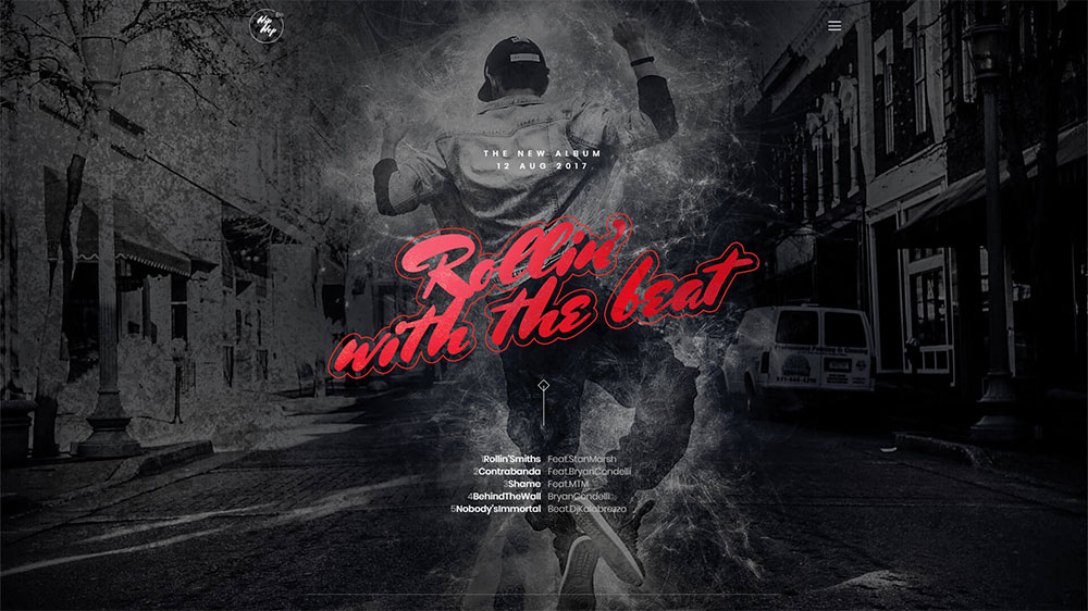
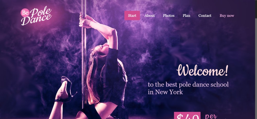
Working with light and shadows can not only produce stunning results but is fun as well. Adding a little smoke to the combination leads to a completely new set of vibes. The emotional effects created can be seen in these music and dance examples. Whether you’re looking for a soft, romantic look –
BeMusician
Or something more dynamic –
BeHipHop
Or on the sultry side –
BePole
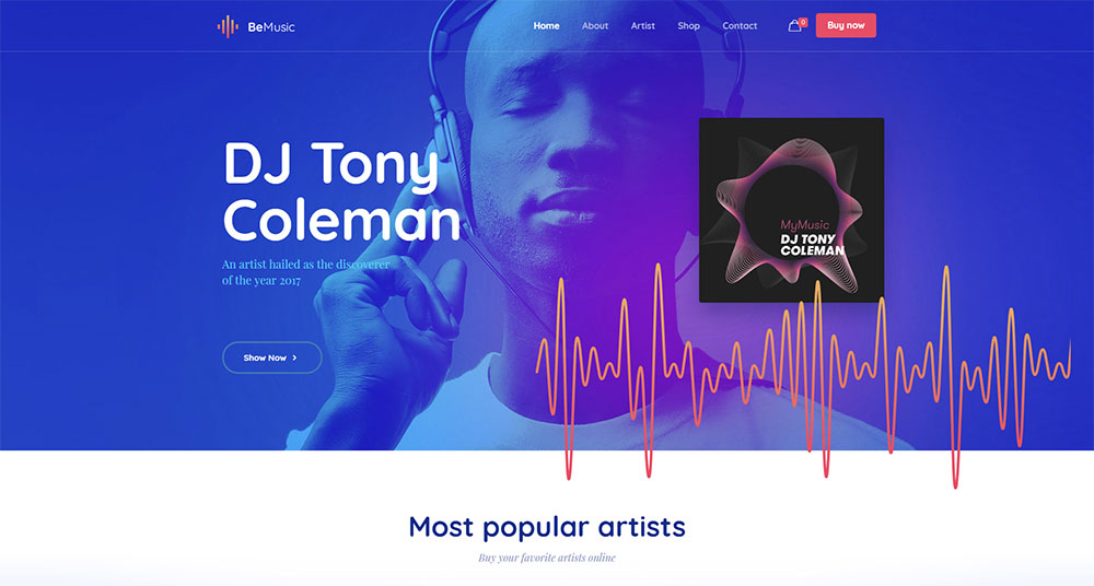
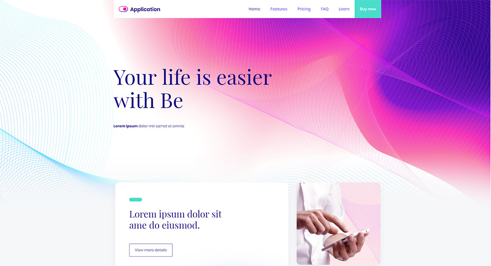
Design Trend #3: Gradients; also Referred to as Color Transitions
Bold, electric colors once reigned supreme. But gradients have taken over in recent months. Gradients work especially well with pastel colors.
They can often be put to even better use when combined with other design trends. They produce some seriously stunning results.
BeMusic2
BeApp3
Design Trend #4: 3D “Moving” Stills
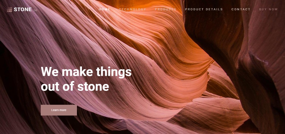
The 3D trend has become a “must have” for many web designers and their clients. The challenge is one of producing an illusion of motion using stills. It is much more difficult than using animated 3D techniques. It can also lead to a more rewarding outcome given the impact an illusion of motion can produce.
Whether it’s a flowing motion –
BeStone
Or a “blossoming” motion
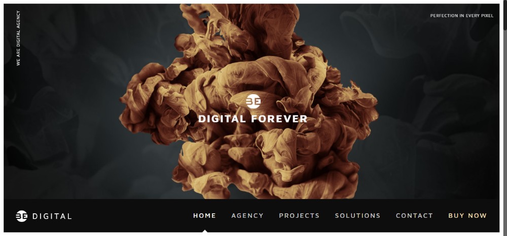
BeDigital
This 3D Moving Still trend is a unique one. It lends itself to incorporating different textures and/or gradients. It is playing with light and shadows, and the use of negative space. It is also working in combination with other trends to get extraordinary results.
Design Trend #5: 2018 Still Life
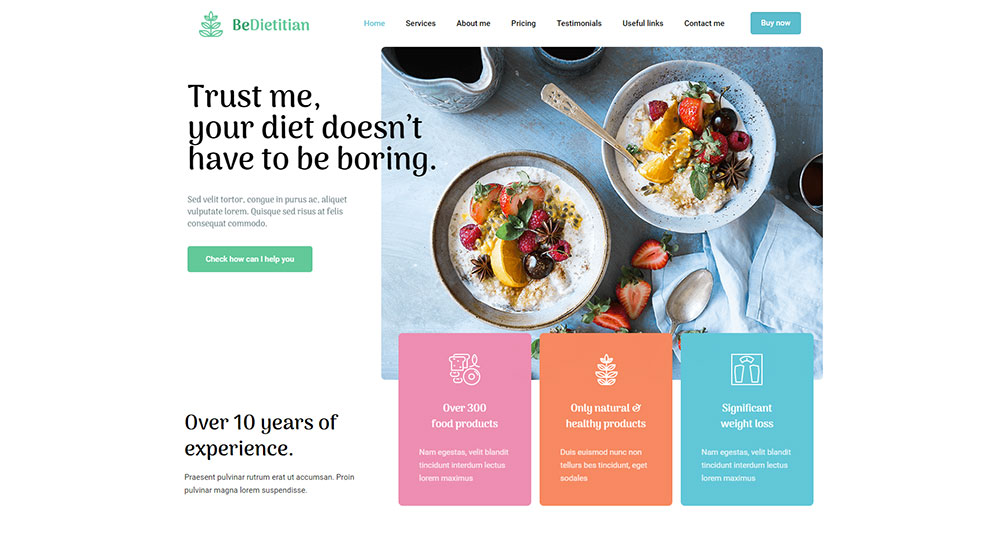
Still, life is unlikely to ever go out of fashion, but it can always be upgraded. To its current applications; 3D for example
BeDietitian
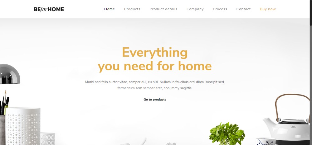
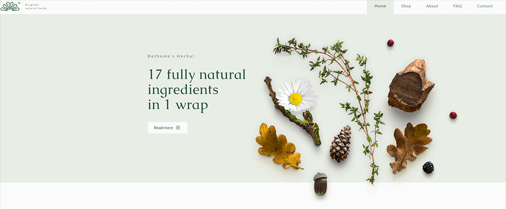
You can also make an impact with photographic images. Especially when coupled with a use of white space as illustrated in these two examples.
BeHome
BeHerbal
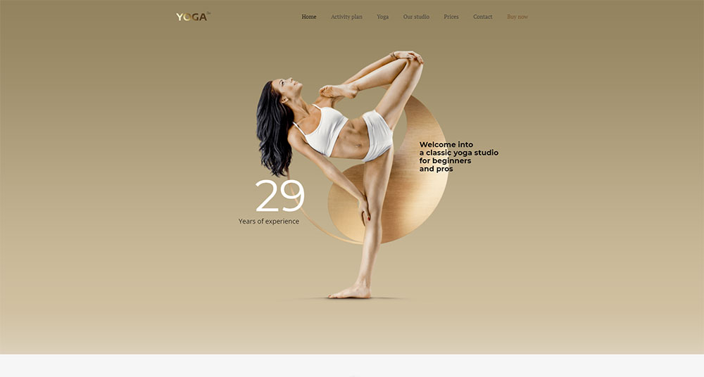
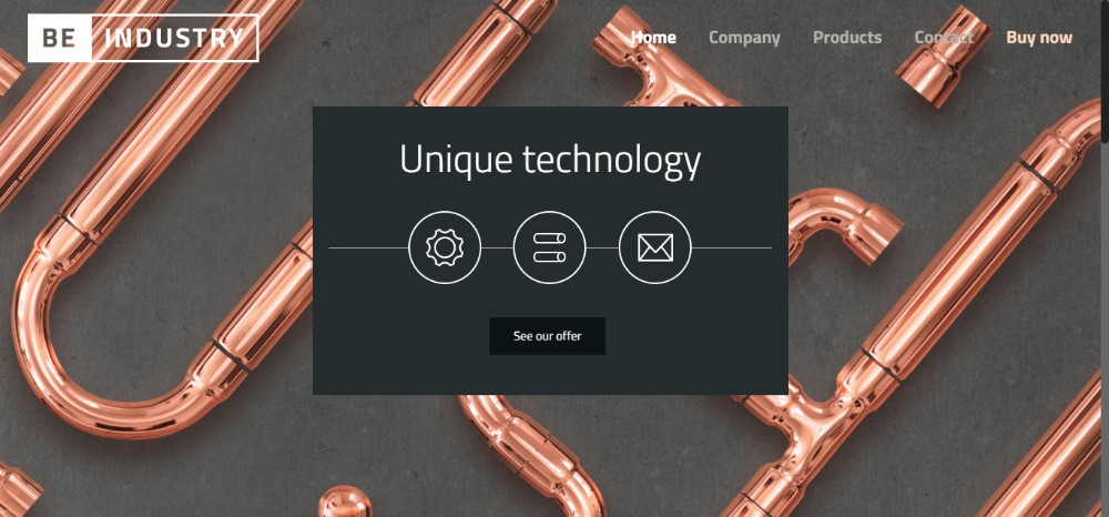
Design Trend #6: Metallic Shine
Metallic shine is one of the more glamorous web design trends. It has lately come into prominence. It has, in fact, become somewhat of a craze, in that it works so well in so many industry sectors and business niches.
BeYoga2
BeIndustry
Metallic shine can be used with 3D elements, many different photos, and illustrations. It goes well with typography and anywhere you would like to add a touch of glamour to a web page.
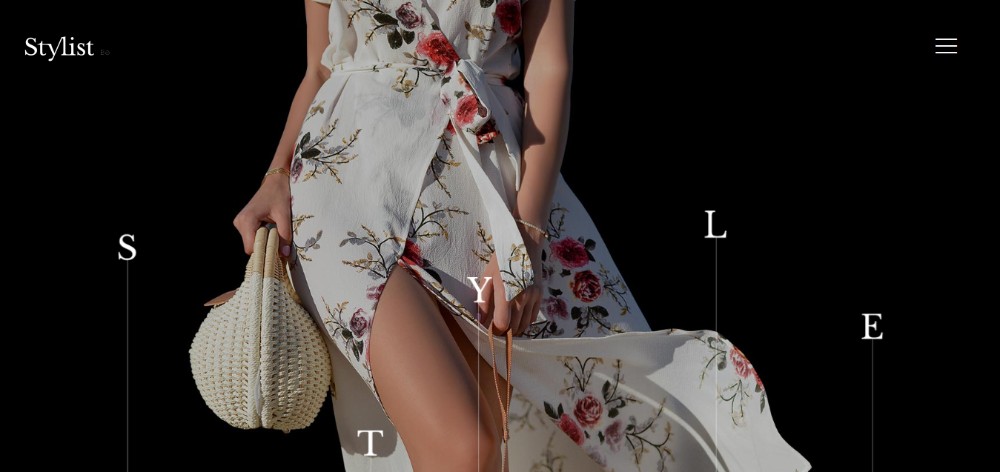
Design Trend #7: Chaotic Typography
Perfect alignment has its place in web design. Typographic chaos has its place as well, and it can be a lot more appealing when put to good use.
Be creative and play around with numbers and letters. See what you come up with in the way of an eye-catching experience.
BeStylist
BeStory
Chaos has its limits, and you need to keep UX in mind. Teasing users for a few milliseconds as they attempt to decipher your message is OK. Just don’t make them have to think too hard. Always keep the page’s goal in mind.
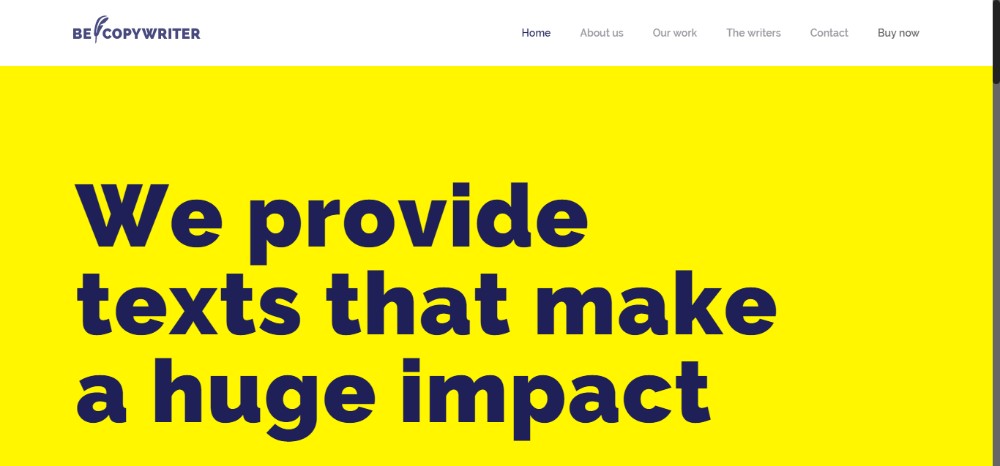
Design Trend #8: Brutalism is Back
This trend represents a comeback of sorts from the 1930s and 40s. That time, shouting was a typical and accepted way of getting attention. Brutalism allows you to speak your mind in a straightforward, crystal-clear, no-nonsense fashion.
Just as is the case with chaos, brutalism has its limits, and you need to be careful in some situations not to overdo it.
BeCopywriter
Wrap-Up
Here’s a wrap-up of the latest 2018 trends. You will see how you can use them in your projects, and how to do so without having to start from scratch:
- Go full creative using illustrations and graphic art
- Experient with light and shadow; add smoke for astonishing effects
- Use color transitions (gradients) in combination with other trends
- Use moving stills for a hypnotizing effect
- Use 3D or photographs to produce modern still life effects
- Add a touch of glamour by incorporating metallic elements into your designs
- To be crystal-clear and straight-forward; use brutalism to convey your message
- Using BeTheme’s pre-built websites is the easiest and best way to follow ALL these trends. You can do so without burning yourself out.












2 thoughts on “These WordPress Theme Followed the Latest Design Trends – With Stunning Results”
This is really helpful to pick the best theme with the provided list.
this a lovely design