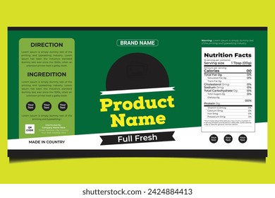
If you’ve been contracted by a client to design a food label for an upcoming product, you’ve probably already realised that there’s a massive number of things to take into consideration if you want to create something beautiful, yet also highly-functional.
You’ll have to think about the target audience, competitors (the aim should be to design a label that differs from the competition), brand identity, product dimensions, and much more. It’s this massive number of variables that makes designing a food product label much more complex when compared to many other forms of design.
What’s more, most clients will be oblivious to the complex nature of the design process; most will simply take the view of “I’ve hired the best label designer, so I expect a great label” without really contributing to the design process in any way. This can make things even more difficult, as most don’t even know what type of label they’ll need for their product (e.g. metallic labels etc.).
Don’t panic, though, as we’ve found an infographic that aims to make the whole thing as simple as possible. You can see it here:


